
Web users form first impressions of web pages in as little as 50 milliseconds (1/20th of a second), according to Canadian researchers. In the blink of an eye, web surfers make nearly instantaneous judgments of a web site’s “visual appeal.” Through the “halo effect” first impressions can color subsequent judgments of perceived credibility, usability, and ultimately influence our purchasing decisions. Creating a fast-loading, visually appealing site can help websites succeed.
“My colleagues believed it would be impossible to really see anything in less than 500 milliseconds,” Dr. Gitte Lindgaard told Nature, which reported the research Lindgaard published in Behaviour and Information Technology.
Researchers led by Dr. Gitte Lindgaard at Carleton University in Ontario wanted to find out how fast people formed first impressions. They tested users by flashing web pages for 500 msec and 50 msec onto the screen, and had participants rate the pages on various scales. The results at both time intervals were consistent between participants, although the longer display produced more consistent results. Yet, in as little as 50 ms, participants formed judgments about images they glimpsed. The “halo effect” of that emotional first impression carries over to cognitive judgments of a web site’s other characteristics including usability and credibility. We talked to Dr. Lindgaard about her study:
Lindgaard: “I was really interested to know if these aesthetics judgments were a mere exposure effect. There are lots of other reasons that affect user satisfaction…. The data we have just published only speak to the speed with which people decide upon an image being shown to them. People decide very quickly how much they like a web page.”
WSO: So if we come to aesthetic judgments (first impressions) within 50-500 ms, is there any cognition involved? Or is 1/20th of a second impression purely a physiological and emotional response?
Lindgaard: “That seems to depend on your age. When a group of high school kids saw the slides for 50 msec they were able to discern much more detail than were older people. People taking part in our experiments were not able to see details, so they had no clue about the informational content. Hence, for adults, this response is unlikely to involve cognition (this corresponds with LeDoux and Damasio’s findings).”
WSO: How does loading speed play a part in your research?
Lindgaard: “I think that speed is an important determinant for a lot of factors.”
The Halo Effect
The speed at which users form value judgments of web pages precludes much cognitive thought. The users tested had an emotional reaction to home pages that they could not control. This pre-cognitive “affective reaction” is a physiological response to what they see on the screen – a gut reaction. This carry over of first impressions to other attributes of products is sometimes called the “halo effect,” or cognitive “confirmation bias” where users search for confirming evidence and ignore evidence contrary to their initial impression. People want to be right, and tend to look for clues that validate their initial hypothesis.
“…the strong impact of the visual appeal of the site seemed to draw attention away from usability problems. This suggests that aesthetics, or visual appeal, factors may be detected first and that these could influence how users judge subsequent experience…. Hence, even if a website is highly usable and provides very useful information presented in a logical arrangement, this may fail to impress a user whose first impression of the site was negative.” – (Lindgaard 2006)
Emotion and Cognition
There clearly is an interplay between our emotional reaction to a webpage, and our conscious thought process. “Consumers apply both holistic (emotional) and analytic (cognitive) judgment in the decision to buy a product.” So that feeling you evoke in users through a “clean, professional design” can have a halo effect on their buying judgments (Fogg 2003).
Sketches versus Photographs in Recognition Speed
Note that a sketch is recognized more readily than a realistic photograph. While he was at the University of Montreal in the 1960s Michael Mills showed that people would recognize a sketch of a hand in about 50 milliseconds, even though the hand had only three fingers and a thumb. They were much worse recognizing a realistic photo of a real hand. The Immuexa site has drawings as icons.
Visual characteristics of Visual Appeal
The study participants also rated home pages on seven visual characteristics. Five of the seven visual characteristics tested correlated well with visual appeal:
| interesting – boring | (r2 = .91, p < .001) |
| good design – bad design | (r2 = .92, p < .001) |
| good color – bad color | (r2 = .90, p < .001) |
| good layout – bad layout | (r2 = .88, p < .001) |
| imaginative – unimaginative | (r2 =.86, p < .001) |
| r2 = squared Pearson Product Moment correlation coefficient | |
Visual appeal and “simple-complex” had a low correlation (r2= .01, p > .80) while there was a moderate correlation between attractiveness and “clear – confusing” judgments (r2 = .39, p < .001).
The Test Pages
Dr. Lindgaard was kind enough to share the top and bottom three webpages in terms of visual appeal. You can find them below, taken in 2002 (note some have changed since then).
Lowest Visual Appeal
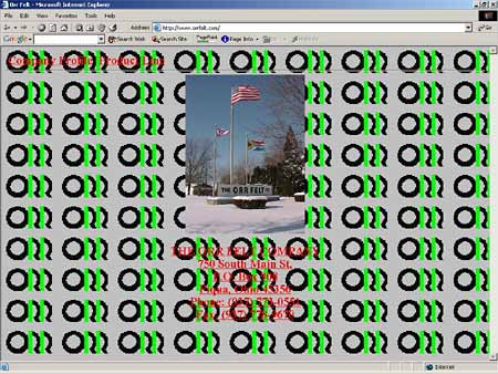
OrrFelt.com Company Home Page
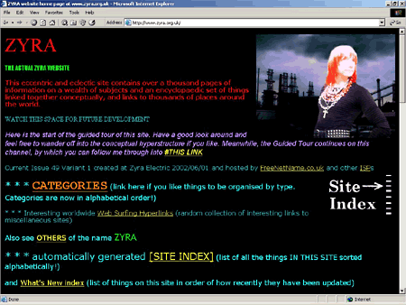
Zyra.org.uk Home Page
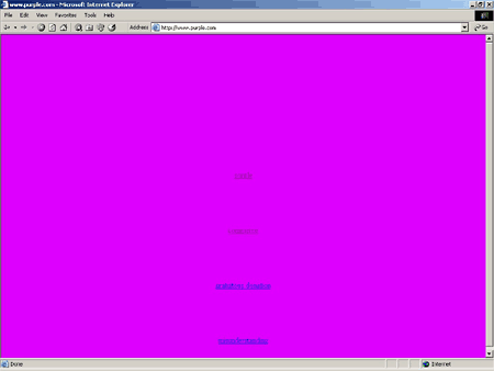
Purple.com Home Page
Highest Visual Appeal
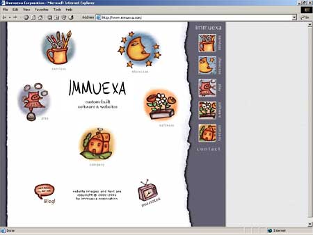
Immuexa.com Home Page
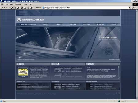
2advanced.com Home Page
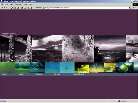
Modestmouse.com Home Page
Conclusion
This research shows that reliable decisions about your site can be made in as little as 1/20th of a second. This emotional judgment can color subsequent judgments made after further reflection. Even though your site may have superior products, services, or usability, an initial negative impression from a poor or slow design can steer customers towards your competition. You only get one chance to create a good first impression, make it count. A clean, professional, and fast-loading site can ensure that your first impression will be a good one.
Further Reading
- BBC News, “First impressions count for web“
- Early news report of the “blink” study after the Nature story. “My colleagues believed it would be impossible to really see anything in less than 500 milliseconds.” BBC News, Jan. 16, 2006
- Carleton University, HOT Lab
- Human Oriented Technology Lab at Carleton University in Ottawa, Ontario Canada researches “interactive technologies for human endeavors with an emphasis on human computer interaction and a user-centred design approach.” Dr. Gitte Lindgaard and her colleagues work at the HOT Lab.
- Damasio, A. R., “A second chance for emotion,”
- in Cognitive Neuroscience of Emotions edited by R. D. Lane and L. Nadel (New York: Oxford University Press, 2000).
- Fogg, B.J., Stanford Guidelines for Web Credibility
- Persuasive Technology Lab. Stanford University, 2002 (revised November 2003). In two surveys of over 2600 people Fogg found that a “clean, professional look” was cited by 46.1% of participants when evaluating sites for web credibility. Information Design/Structure was cited 28.5% of the time, while Information Focus was cited 25.1% of the time. While the factors varied for different types of sites, disguised advertising and popup ads, stale content, broken or uncredible links, difficult navigation, typographic errors, popup ads, and slow or unavailable sites were found to harm credibility the most.
- Gladwell, M., Blink: the power of thinking without thinking
- A fascinating book about how accurate our first impressions can be, especially among those with a lifetime of experience (art appraisers for example). (New York: Little, Brown, and Co., 2005)
- Hopkin, M., Web Users Judge Sites in the Blink of an Eye
- Nature first reported on the study online on Jan. 13, 2006.
- King, A., “Response Time: Eight Seconds, Plus or Minus Two,”
- in Speed Up Your Site: Web Site Optimization (http://www.speedupyoursite.com), Indianapolis: New Riders Publishing, 2003. The consensus among HCI researchers is to deliver useful content within 1 to 2 seconds (navigation bar, search form) and your entire page within 8 to 10 seconds (8.6 seconds was the figure most cited).
- King, A., “Flow in Web Design,”
- in Speed Up Your Site: Web Site Optimization (http://www.speedupyoursite.com), Indianapolis: New Riders Publishing, 2003. Fast, well-designed sites can actually create a flow state in users. In fact, according to a recent study, over 47% of users have experienced flow on the Web.
- Ledoux, J., The Emotional Brain: The Mysterious Underpinnings of Emotional Life
- (New York: Simon & Schuster, 1996).
- Lindgaard G., Fernandes G. J., Dudek C. & Brown, J., “Attention web designers: You have 50 milliseconds to make a good first impression!”
- Tested subjects by displaying web pages (saved to disk) for 500ms or 50ms for “visual appeal.” The report concludes that “…visual appeal can be assessed within 50 msec suggesting that web designers have about 50msec to make a good first impression.” Behaviour and Information Technology, 25:115 – 126 (2006).
As a web designer (who has also heard stories from a large number of other designers) I am continually amazed by the number of people who will push their design ethic over that of a trained professional.
When you’re speaking in terms of milliseconds, you’re dealing with decisions that are below the level of concious thought … something that designers are trained to deal with.
Andrew,
My hat goes off to web designers, they deal with clients (many of them demanding) every day. I’ve been working with web designers for clients for many moons now, and see first-hand what they go through. Despite the angst, there are moments of brilliance when you first see that new website. I think it is those brief “wow” moments that keeps designers going.
But creating a “clean, professional design” as B.J. Fogg talks about is not an easy task on the Web. The Web has constraints (screen size, XHTML, bandwidth, etc.) which are a moving target and limiting. Creating appealing sites that convert visitors yet load reasonably fast is not easy. What I found interesting about this study is the speed of the reaction, and how it can influence subsequent judgments. – Andy
Nice article, Andy. I would like to put the study into perspective for your readers. First, our data say nothing about upload times and the relationship between those and first impressions. We can speculate (as I did in my comment to you) that users are not pleased if they have to wait for a site to appear, but our data cannot comment on that.
Second, it should be noted that the first impression would be important for companies whose services and products are in competition with many others on the web. If I have one or more pages of links to look at, all companies that offer the same or similar products/services, and I don’t like a site, I won’t hang around in there but will go on to the next quick smart. Yet, if users come to my e-commerce site because they know they want my product, because their previous interactions with my company have been positive, or because there’s only one company in the world offering the particular service/product I am after, you can afford to present yourself in any way you like – you could be as ugly as sin; I have already decided to buy from you before I enter your site, so I’m not going to be put off by your ugliness.
My third point is that the distinction between emotion and cognition, to the extent that we define cognition as ‘rational thought’, is becoming increasingly blurred. Once I have formed an impression, I will selectively search for information confirming that impression – I want to ‘prove’ to myself that I made a good decision! So, if the first impression is negative, I’ll look out for everything and anything negative. Likewise, if I like what I see right away, I’ll look for positive information to reinforce my impression. So, my ‘rational thought’ is likely to be coloured by my emotional impression. It is not entirely neutral or even ‘rational’ 😉
The comment by the previous writer is correct – that first physiologically-based impression is indeed pre-cognitive. That is why it is so interesting to me.
I too, feel sorry for web designers. My brother is a designer and developer. He often calls me to take a look at some of the awful things that his clients want on their web sites. He submits an excellent design, and the client wants some kind of horrific, bandwidth-sucking, self-indulgent site with spinning, flashing, movies and awful music.
The best thing that can be done for web design is to leave it to the designers!
Personally I find the ‘clean’ homepages with as little graphic as possible test best. I cannot fathom why ‘modestmousemusic’ scores high at all.
The visual appeal is certainly there.. the usability? Nah. I want text.
One of the highest scorings sites for me is quite simply en.wikipedia.com, with it’s clean textual design.
Also high scoring is “the slashdot style” as seen on slashdot, kuro5hin, http://www.rootprompt.com, and other places. google also have an excellent design.
As for company homepages, I’m dead tired of all those flashy brand-making ones. I want information. The main things I want from a company homepage is quite simple:
– What do they offer?
– Various contact information.
– If they offer products, information (not ads!!) for their products. I couldn’t care less about their ads .. the specs of the product on the other hand.. 🙂
The design is less important than the actual content. At least in my opinion.
I have made some awful web sites for clients, because that’s what they wanted, despite my best efforts to convince them otherwise.
Some people will never learn.
I am very surprised to see the zyra.org.uk site shown as a bad example, and would be interested to see the detailed factors which go into making this evaluation.
While the other two are quite obviously bad, it doesn’t have any obvious problems. It doesn’t share the poor contrast problem seen on the purple.com website, not the naff and obfuscating background seen on the orffelt.com site. It also downloads instantly, even with a dialup connection.
In contrast, the new version of the 2advanced.com site includes a number of usability problems like the flash assumption, the minimum screen size assumption and the “enter here” page problem, not to mention a thing saying that broadband is required.
The new version of modestmousemusic.com also shares the flash assumption as well.
Also zyra.org.uk seems to work irrelevent of which page you enter from and appears to do well on search engines.
I would also be curious to see how a more recent review of the sites changes what people find important for making these decisions.
Interesting article. I can’t say what other people like. A lot depends on why people go to a particular site (Entertainment, research or to shop). Perhaps if someone created a service that a person could subscribe to that a would allow a surfer to express their visual preferences, then site designers could create multiple looks for a site which would be customized to the particular surfer. Then people could look at sites that would be visually appealing to them.
For example, my preference is for a site that loads extremely fast, is uncluttered, is primarily text based and has strong visual contrast. (I hate those sites that have colored backgrounds making it more difficult to read text overlayed on the background.) I also want the text to appear in large print because I don’t have perfect eyesight.
The basic problem that I have with this article is that it assumes that the answer is to make something that is appealing to the largest number of people. My view is that the designer should make the site appeal to me and to other visitors by automatically changing to my preferences when I view the site.
Those “Highest Visual Appeal” websites (like Modestmousemusic.com) would take far longer than 50 milliseconds to load.
Speed & simplicity works. Example: Google.com
I mean, Craigslist.org probably ranks low on “visual appeal”, but it’s simple, fast, and far more successful than other websites with bloated graphics.
Dr. Lindgaard,
Fascinating study for any web designer, thanks.
Would you mind clarifying a few details?
1 – were volunteers in trials 1, 2 and 3 all different?
2 – did volunteers know beforehand how long the images would be displayed to them – 50 ms, 500 ms or longer
3 – did volunteers get a chance, perhaps off the record, to revisit their verdicts for the sites based on longer more careful inspection?
4 – how many websites were used, from which industries, and how were they chosen?
Thanks in advance for any advice, truly appreciated,
Kyril Mossin,
web designer
Remember dear readers (welcome slashdotters) that the web pages were evaluated *after* they loaded. I asked Dr. Lindgaard specifically about this, they stored the screen shots and flashed them up onto the screen. So they evaluated how humans react to web pages after they’ve fully loaded.
I don’t know many websites that load in 50 msec or less 🙂 As for page load time, generally speaking you have about 8-10 seconds to capture their attention, based on the research I did for my book. This tolerance for delay can vary depending on a number of factors (perceived complexity, bandwidth, age, etc.) A “layered load” where useful content displays quickly (1-2 seconds) is better than a non-layered load where the entire page displays at once.
How people react to pages as they load needs more study. I read one study that showed one of the worst things you can do is slow down your page (responding to input) *after* it loads, with a CPU-intensive Flash gizmo, or DHTML menu creation, etc. Dr. Lindgaard and her team are studying some other factors mentioned in this article, I’m looking forward to seeing what they discover.
I think one important thing to remember here is that the users were shown the sites, they weren’t necessarily browsing for anything in particular. Thusly, it suprises me not at all that Modest Mouse’s site scored highly. Why? Because it’s a bunch of pretty pictures. There’s no information there whatsoever.
Whereas if the person was actually looking for a specific product, they would be turned off by the Modest Mouse site. Why? Because it’s a bunch of pretty pictures. There’s no information there whatsoever.
I think this test proves that a person, at a base level, can be impacted by a site in 50ms. I don’t think it says anything about people who would like to look at the site for more than 50ms, because then sites with pretty pictures (Modest Mouse) and no content would score much lower.
IMO, the best site shown there is the second place finisher, 2advanced.com. It actually combines a pleasant look with textual information. On the other hand, its usefulness (an easy to view background), also hurts it when it’s blasted at the viewer for 1/20th of a second. In that amount of time, the grey background, text, and single (but nice) image is lost compared to the shiny, image-filled, and mellow purple colored Modest Mouse site.
Well, as regards professional designers vs. amateurs, what about my university’s site at
http://www.louisiana.edu , designed by professionals, and my departments’, at http://languages.louisiana.edu and http://las.louisiana.edu , designed, created and maintained by amateurs? It was the professionals who wanted the flashy graphics, heavy code and jarring colors. We couldn’t take it, because we have to refer to these pages every day. The flashiness is attractive initially, and fancy designs may sell better. But for users, they get tiring pretty fast. Comments/suggestions are more than welcome!
flashy site way too busy… gives viewer instant headache
student site too punchy with single heavy graphic… text too small
in my opinion
comments on my site welcomed
load time = self worth ie: what did the people who made the web site feel it was worth and in turn what did they spend on the server bandwidth.
flash media looks pretty but takes longer to discern the content.
slap happy web sites good or bad depends on content.
there are alot of cognitive functions involved “should I stay or should I go” it’s a language unto itself. slashdot is ugly but its a great site.
Design plays a competitive advantage but simplicity in a website is even more important according to me. I want to get to the information on a site. 1/20 sec is too little for me to even check out the navigation. It purely tests my aesthetic sense and nothing more…
There appear to be several potential flaws in the report, or perhaps in the research design itself. First, I don’t recall how long an image stays resident on the retina if flashed for 50 msec, but if the flashed image is followed by a blank screen, ie, nothing washes the retina to erase it, it may be there for longer than 50 msec. That’s a question to address to vision physiologists. Secondly, once the image has been “recorded,” ie, written to the brain, one could continue to process it for a while. In other words, you may continue to ponder what you saw in this experimental setting, and, although you only got it flashed for 50 msec, you could very well process it for longer before rendering judgment, perhaps for half a second or so, maybe more.
I think the study doesn’t really get at how long it takes to make a judgment about what you see but rather how little time you can be exposed to an image in order to make a judgment–two very different things. The former is much more difficult to get at than the latter. One could conceive of an experiment where subjects are asked a question that has a simple yes/no answer prior to the flash on the screen and then have them answer the question (say, one of the questions from the questionaire) as quickly as they can, and control for reaction time. Under those conditions, you may get a measure of how long it takes for a person to make a judgment. I know this is probably too much science for the purposes of designing web pages, but when my son, a human-computer interaction (HCI) expert, told me of the study, I, like the author’s colleagues was in disbelief that a person could make a judgment in so short a time. I still am.
What good is it to try to inspire in 50 ms when services such as Cox (high speed cable) often can’t get even the initial data on a simple site to the viewer in less than a couple of minutes. The problems may be in domain name lookup or elsewhere, but about 25% of my viewing, including from bookmarks (Firefox 1.5) either never load (error message – cannot find site) or take what seems like forever. And that’s with sites I am very familiar with and visit almost daily. That problem, whatever the cause, MUST be fixed first before any emphasis on the appearance of a web page will have any impact.
I think the main objective of the particular study was to solidify the importance of “first impressions”. Regardless of what information is displayed, visual preference is what drives a majority of good websites to great websites. I dabble in designing websites and understand the importance core components; clean, usability, quickness, etc. That tends to be my style however, what makes a good web designer / web developer better is being able to incorporate the core components for great site interaction with a stunning visual display. Some readers of this study could not understand why / how certain sites were chosen above others, and I think it relates more to this example. Imagine your favorite meal, whether it is fish and chips, pizza, or lasagna, but now remember how you feel when you see the waiter / spouse bring it from the kitchen on a seaming plate but, your first glimpse is not what you expect. It smells like your favorite food, but it looks like something totally different (insert your own awful noun here, ex. shoe leather, trash, sour milk). Regardless of the smell or taste it would be very difficult to choke it down after you have seen what it looks like. From that point on, your thoughts on your favorite food have changed. Now imagine if that was the first time you ever ate that food, most likely regardless of the taste, it would be the last. Much the same with today’s current websites, if I am searching for something particular and Google returns 10,000+ sites a quick click and I am choosing a different link that looks more appealing. Unfortunately some of the sites with the best content often look the worst and force people to wade through unappealing user experience, which even though they did, they won’t most likely be back. I would agree with the author in saying that just like with people, stores, and websites, people form visual first impressions in a split second, which take a lifetime to change. In reading this study, I can only hope that more professional web designers take note and attempt to integrate better visual display to their sites. -se
After a few years in the Web Development arena, I learned that first impression also plays a major role online. I personally click away from a websites if the design quality is not appealing to me.
I’m glad they were able to come up with the study to make it official. Being aware of it allows me to provide my clients with the ultimate Web Development services to increase their bottom line.
Jorge Garifuna
Professional Web Developer
Studies proving the benefit of well designed web sites will hopefully help to persaude people to trust the advice of a knowledgeable designer when it comes to building a quality web site. The importance of that design is shown to be paramount.
The people who understand this will get a site that will viewed by more people in the end.
Great information on design, makes you think alot about your first impression.
Interesting article, best advice as always when dealing with design is – less IS more…keep it simple.
JT
Over the years I’ve built about a dozen eccomerce sites for myself and literally hundreds for clients. The simple fact of the matter is that those not intimately familiar with the web as a medium fixate on all the wrong things. I’ve spent 3 months of design iterations on minor issues with clients who won’t take my advice to more prominently place the value propositions of their products. Guess what? The sites don’t convert. My personal sites on the otherhand take a few days tops and I’ve seen conversion rates in the 8-10% range on some of them.
Want a succesful site? What it looks like is far less important than how simple it is to use and how well your copy convinces the user to buy what you’re selling. Obviously the terrible “My home page” circa 1996s above are just so bad they would fail… but the difference between a 7 design and a 10 design has more to do with the egos involved than the success of the site.
Tom Nelson (Jan. 20 ) had an interesting idea about the preferences of the surfer deciding how the site looked. It sounds like a slight modification of “Stumble.com” where your judgements on different sites determines which sites will show up next time You let the program randomly pick a site for You.
As an extreme example on a downdesigned site, go to “Kokokaka.com”. They get loads and loads of prices for the site they make for clients. This is their own site!!!
Unless the first impression is favourable, visitors will be out of your site before they even know that you might be offering more than your competitors isnt it?
Most users do judge the website based solely on appearance. But remember, every industry has it own standards. Most people think in my opinion that pictures represents the website.
The last comment is the most thoughtful: every site has its own needs. An e-commerce site should not be minimal but a site for a visual artist should not have too many distractions.
The first thing to determine is what style suits the purpose of the site, then perhaps publish this in the public domain (if we want the lay web publisher to stop publishing ugly pages).
What I learned from the example websites is that navigation is important for a first impression. Having something catchy that draws your eye and wants you to find out more about the website and something that tells you right away that this is the website that you want for your needs.
User focused design
The big challenge for websites (and for the clients that want them) is user focused design. Unlike posters, books or pamphlets websites are machines that users interact with. Unlike earlier printed materials, a web user is not only faced with a bigger cognitive challenge, but always has the choice of going elsewhere.
Websites have to always be about these users. Many clients are too self-focused to see this.
Getting clients to think (about themselves) less
I think that the blink test is a good way to cut down on this. It may not be scientific but presenting designs to clients as ‘blinks’ can cut down on self-indulgence and micro managing.
If people believe a website looks good, then this positive quality will spread to other areas, such as the website’s content.
Since people like to be right, they will continue to use the website that made a good first impression, as this will further confirm that their initial decision was a good one.
At CustomerSense we often test how customers react to different types of design.
We make use of the “blink test” to decide which design to implement at e-commerce websites and can (statistically) support the fact, that the first impression matters a lot.
The bounce rate and thus ultimately conversion rate has improved (sometimes dramatically) “just” by targeting the first emotional reactions to the type of products / services our clients are selling.