
A common visual element in many websites is to position two blocks of content on either end of a navigation bar. The left block of content typically displays global navigational tabs or drop-down menus. The right shows today’s date or perhaps a simplified search form. This article shows how to create a “bookend” look with elements on either end of a box using CSS-styled lists. This CSS-layout technique saves a significant amount of HTML code over table-based techniques. Tests with working code yielded savings in page size ranging from 30% overall to over 73% for the HTML code alone.
The Humble Masthead
The masthead or header of many sites imitates the main masthead of print-based publications. One or more masthead layers can display bookended content for that professional “newspaper” look. Not surprisingly, a number of news sites have adopted this left/right layout (see Figures 1 and 2). However, the sites tested use table-based layout techniques when list-based techniques could save 30% to 50% off of HTML file size. The amount of savings depends on how many similar bookend elements are used within the page.

Figure 1: Bostonglobe.com Home Page Masthead
The Boston Globe uses a bookend masthead (see Figure 1) with a conventional table-based layout. Table cells are used to align content left and right and take up 100% of the masthead (see code below):
    id="secnav_obituaries">Obituaries
</div></td>
<td align="right"><div class="secNavLinks" style="padding-right: 10px;"><a
href="http://www.boston.com/news/traffic"
id="secnav_traffic">Traffic</a>  |  <a
href="http://www.boston.com/news/weather"
id="secnav_weather">Weather</a> </div>
</td>
</tr></table>
CNN.com uses a similar technique for their home page, with a compound bookend nav bar up top, created with tables (see Figure 2).

Figure 2: CNN.com Home Page Masthead
Bookend Lists Tutorial
A more efficient way to create bookend mastheads is to use CSS to morph XHTML structural elements to do your bidding. In this case we use descriptive lists (DL/DT/DD) and CSS to position one element on the left (DT), and the other on the right (DD). The first step is to create a header with an embedded list:
<div class="head">
<dl>
<dt>Left</dt>
<dd>Right</dd>
</dl>
</div>
The code above creates a labeled DIV that contains a one-item descriptive list. Next we use CSS to float the DT to the left, and align the DD text to the right.
dl {
margin: 0;
padding: 0;
width: 100%;
}
dt {
font-size:0.8em;
padding: 4px 11px 2px;
float: left;
}
dd {
font-size: 0.8em;
text-align: right;
padding: 4px 11px 0 0;
}
In the above CSS we zero out the margins and padding on our DL, and float the descriptive term (DT) left. With a 100% width DL we align the text to the right in the description and presto, a bookend list!
Adding Background Color and Rounded Corners
Next we’ll add a colored background and some rounded corners. The CSS that follows adds a background color and width to our container DIV and assigns background images to our positioned DL and DT:
.head {background:#aaeebb;width:300px;margin:0;padding:0;}
.head  dl {background: url(cornerr.gif) top right no-repeat;}
.head  dt {background: url(cornerl.gif) top left no-repeat;}
The above code gives us our bookended header (see Figure 3). Note that there is a way to save one HTTP request here by combining the two corners into one compound image and using CSS to position and clip. We’ll save that technique for a future speed tweak.
Figure 3: Bookend List Header
Adding Content
Next we add a box to hold some content, aligned below the header above.
.box {
width:300px;
border:1px solid #aaeebb;
margin:0 0 15px;
padding:10px;
font-size:0.8em;
}
h3{margin:0;padding:0;font-size:1.1em;}
p{padding:0;padding-top:10px;margin:0;}
...
<div class="box">
<h3>Bookend Lists Save Bytes</h3>
<p><i>Flash</i>: In a breaking news story...</p>
</div>
The DIV above creates a 300-pixel wide container for our content, complete with padding and border. IE and Firefox have a disagreement on their box models, however. Firefox interprets the W3C specification correctly and adds borders and padding to the box width, while IE simply adds padding and borders inside the 300px container with no change in width. This looks fine in IE, but we end up with a step in Firefox (see Figure 4):
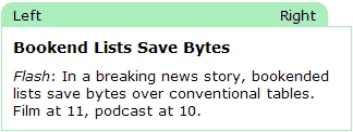
Figure 4: Bookend List plus Box shows difference in Box Models
Fixing Different Box Models
There are a couple ways to fix this behavior. One involves nested DIVs and applying styles selectively to each DIV. A more elegant solution is to make Firefox behave like IE by forcing its box sizing algorithm to emulate IE with the following proprietary code:
* {
-moz-box-sizing: border-box;
}
The CSS above uses the universal selector (asterisk or “*”) to force Firefox to behave like IE and add borders and padding to the inside of the DIV instead of the outside. The resulting header and box combination now aligns perfectly in IE and Firefox (see Figure 5).
Figure 5: Firefox bookend list box after box model fix
One More Quirk
We found one more quirk in our bookend lists. In order to make the elements align vertically in Firefox we found it necessary to add a <br clear="left"> to the DD element.
<div class="head">
<dl><dt>Left</dt><dd>Right<br clear="left" /></dd></dl></div>
A CSS-based fix would be more efficient here, if anyone discovers one let me know.
Bookend Header with Tables
By way of comparison, the following code creates the same effect using tables (note that the code was tweaked to work with IE and Firefox, your mileage may vary):
.table {margin:0 0 15px;}
.table td{font-size:.8em;}
.table tr.head2 td.mid{background:#aaeebb;margin:0;padding:0;}
.table tr.head2 td p{padding:4px 0 2px;margin:0;}
...
<table width="300" cellpadding="0" cellspacing="0" border="0" class="table">
<tr class="head2"><td width="11" align="left" class="mid" valign="top">
<img src="cornerl.gif" width="11" height="15" alt=""></td>
<td align="left" width="48%" class="mid"><p>Left</p></td>
<td align="right" width="48%" class="mid"><p>Right</p></td>
<td align="right" width="11" class="mid" height="15" valign="top">
<img src="cornerr.gif" width="11" alt=""></td></tr>
<tr><td colspan="4" class="box">
<h3>Bookend Lists Save Bytes</h3>
<p><i>Flash</i>: In a breaking news story, bookended lists save bytes
over conventional tables. Film at 11, podcast at 10.</p>
</td></tr></table>
Note how inefficient this code is compared to the CSS and list-based code above. The content to markup ratio is much lower as well, which makes it more difficult to achieve high SEO rankings and speed. Eagle-eyed readers will note that the above table-based code could theoretically be improved using CSS more efficiently (contextual selectors rather than embedded classes). This would buy us a few bytes, if we could get the table cell height to behave across browsers.
Bookend Lists in Action
In real-world applications this technique would be used multiple times for bookend mastheads and repeated headers. One site that is using bookend lists to its advantage is my.netzero.net (see Figure 6).
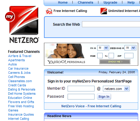
Figure 6: my.netzero.net home page uses bookend lists
Netzero uses bookend lists for multiple headers on their personalized start page (welcome, stock quotes, and weather headers). The more bookends you use, the more you’ll save with the power of CSS rules. Netzero uses tables for the content box to avoid the above box-model bug however, and could save even more switching to the above pure CSS technique.
<div class=tileHead><dl><dt>Welcome!</dt><dd>Friday, February 24, 2006<br clear=left /></dd></dl>
</div>
<div class=tile id=welcome><table width=313 cellpadding=0 cellspacing=0 border=0>
<tr><td><div id=welcomeContents><h3>Sign in to your myNetZero Personalized StartPage</h3>
...
Comparison of Table and CSS layout of Bookend Headers
To compare the two layout methods, let’s create a three-box test. In the example below, tables are used to create bookend headers and matching boxes on the left, while CSS is used to create bookend headers and boxes on the right (see Figure 7).
Figure 7: Table and CSS bookend header layout methods compared
| Tables for bookend layout | DIVs and CSS Lists for Layout | |||||||||||||||||||||||||
|---|---|---|---|---|---|---|---|---|---|---|---|---|---|---|---|---|---|---|---|---|---|---|---|---|---|---|
|
Bookend Lists Save BytesFlash: In a breaking news story, bookended lists save bytes over conventional tables. Film at 11, podcast at 10.
Bookend Lists Save Bytes2Flash: In a breaking news story, bookended lists save bytes over conventional tables. Film at 11, podcast at 10.
Bookend Lists Save Bytes3Flash: In a breaking news story, bookended lists save bytes over conventional tables. Film at 11, podcast at 10. |
|||||||||||||||||||||||||
The layouts appear identical in IE and Firefox, but the CSS version is significantly smaller. Table 1 shows the difference in code size. The HTML alone is 78.1% smaller using CSS bookend lists versus tables. HTML plus CSS (no content) is 42.1% smaller, while overall (HTML + CSS + content) the page is 32.4% smaller. The last two measures will improve as more bookend headers are added since the presentation is controlled by a single set of CSS rules, not embedded in each layout table.
| Page Component | Tables | DIV | % savings |
|---|---|---|---|
| HTML only | 1513 | 331 | 78.1% |
| HTML+content | 1975 | 819 | 58.5% |
| HTML + CSS | 1796 | 1039 | 42.1% |
| CSS | 283 | 675 | -138% |
| Total (HTML+CSS+content) | 2258 | 1527 | 32.4% |
Off Safari
Safari still has the step we mentioned above, however. The mozilla CSS hack we used to make Firefox behave like IE’s non-compliant box model doesn’t work in Safari. We fall back to the nested DIV solution, putting the padding and border on an interior DIV, with the width assigned to the exterior DIV of our content box like this.
.box2 {
width:300px;
margin:0 0 15px;
padding:0;
font-size:0.8em;
}
.box3 {
border:1px solid #aaeebb;
padding:10px;
}
...
BOOKEND HEADER GOES HERE
<div class="box2">
<div class="box3">
<h3>Bookend with Nested DIVs</h3>
<p><i>Flash</i>: In a breaking news story, bookended lists save bytes over conventional tables. Film at 11, podcast at 10.</p>
</div>
</div>
The nested DIV solution uses a bit more code, but works in Safari, IE, and Firefox. Table 2 shows the difference in code efficiency between tables and bookend headers and nested DIVs for the deck (content box).
- Left
- Right
Bookend with Nested DIVs
Flash: In a breaking news story, bookended lists save bytes over conventional tables. Film at 11, podcast at 10.
- Left2
- Right2
Bookend with Nested DIVs
Flash: In a breaking news story, bookended lists save bytes over conventional tables. Film at 11, podcast at 10.
- Left3
- Right3
Bookend with Nested DIVs
Flash: In a breaking news story, bookended lists save bytes over conventional tables. Film at 11, podcast at 10.
| Page Component | Tables | DIV | % savings |
|---|---|---|---|
| HTML only | 1513 | 406 | 73.2% |
| HTML+content | 1975 | 894 | 54.7% |
| HTML + CSS | 1796 | 1102 | 38.6% |
| CSS | 283 | 696 | -146% |
| Total (HTML+CSS+content) | 2258 | 1590 | 29.6% |
Conclusion
With the advent of modern browsers CSS has come of age. With minor box-model workarounds you can use CSS to position list elements into a two-column layout to replace old table-layout methods. Savings ranged from 38.6% for HTML and CSS code alone, to over 73% for the HTML itself. Improving the content to markup ratio also helps to raise search engine visibility by getting your layout code out of the way of your content.
Further Reading
- my.netzero.net
- Netzero uses bookend lists on their customized start page.
- Practical CSS Layout Tips, Tricks, & Techniques
- This article shows how to use floats to replace two-column table layouts. Mark Newhouse includes an opposite end float example using DIVs. The code above uses descriptive lists instead of DIVs which is more efficient.
Your use of the element is totally incorrect for this application.
Actually I think it is pretty creative, although I can’t take credit for the original idea. I’ve taken the bookend header idea and extended it with a non-table content box. The alternative is to use DIVs, which is less efficient, or tables which as you see above are very inefficient. Or even worse use a graphic header and have no text at all.
We’ve taken an XHTML structural element and morphed it with CSS. Yes it is not a descriptive list, but lists are used for all sorts of things (menus, two-columns etc.) this is an extension of that.
I found a bug in the original article, Safari still has the step with the mozilla box model hack, so I fell back to the nested DIV solution, which works in Safari.
There may be another workaround for that pesky box model problem. You can use the new CSS3 box sizing command plus the above-mentioned mozilla CSS box model code, thus:
box-sizing: border-box;
-moz-box-sizing: border-box;
See more details at:
Box Model Tweaking
– Andy
There are other browsers on earth than IE and FF (and I know you are aware of that), so writing optimized html and css code that only IE and FF render properly is not a very good idea.
Design your websites with usability, accessibility and compatibility in mind. The nested div example is definitely the way to go. After all, Safari and Opera (and other browsers too) are gaining marketshare, so don’t leave the users of alternative browsers behind. Ever.
(Yes, I am aware of the fact that it’s just an example, but in order to make us web developers aware of the compatibility issues you encounter when you layout web pages I think it’s very important to teach us how to make compatible code, not necessarily optimized.)
Hein,
Yes, there are indeed other browsers out there. The article shows how to morph a list into a double-ended nav bar. It is the box (model) below that is the pesky problem. The nested DIV method bypasses browser quirks, and the CSS3 box model rule is another possibility. This article shows the typical flow of trying CSS techniques out, and your point is well taken. You need to test your creation on as many browsers as possible. Set a browser floor, and hopefully gracefully degrade below that, and test on different browsers.
The problem with the first hack (mozilla CSS hack) is that it makes other browser box models behave like IE, which doesn’t follow the W3C specification. This can cause problems for newer/other browsers that don’t recognize the hack. That is why I suggest the nested DIV method. At least until the new CSS3 rule kicks in. Tantek came up with a CSS3 rule:
box-sizing: border-box;
that rectifies the problem, and I understand that some Mac browsers already support this CSS3 rule. As browsers evolve to support more CSS2 and CSS3 the CSS landscape changes, and the hacks of the past become less necessary.
– Andy
I agree with the first comment. Your use of _definition_ lists for this is semantic nonsense.
You might think it’s “creative” but that really doesn’t matter–semantics are not meant to be creatively applied. You can use CSS to style the elements creatively, but getting creative with the application of semantics is incorrect and creates all sorts of usability and accessibility issues. In this case, if you just _had_ to use a DL (over an unordered list), then at least use it right: use the DT to state what the DD’s are, and apply classes or ID’s to the DD’s to do the layout; then use display:none on the DT so that you don’t see it visually, but the description is still there when CSS is not applied.
Description
Left
Right
If we could use child selectors, we wouldn’t need the id’s, but it’s an IE6 world still .
Good and solid points you make in the article. However, I’m a bit worried about using hacks to make Mozilla behave incorrectly on the box model. That’s a bit too “anti-webstandards” for me.
Bandwidth savings on 30% to 70% as you describe are not extreme. Furthermore it will also lead to (hopefully) easier maintenance and lower risk of change.
You may also be interested in my recent article “Why webstandards matter (case study)” http://justaddwater.dk/2006/06/29/webstandards-case-study/
After reading your article it appears that the best way to create these mastheads is to use tables. No need for tweaks, hacks, etc. Maybe someday when all browsers interpret CSS in a universal way can we rely on it for creating complex layouts.
The use of the DL is completely semantically incorrect. It would be better to use two spans to mark up the bookends.
The use of the Mozilla only CSS rule is also totally against web standards and should not be used. It has caused problems in Safari as one user has pointed out and also breaks in other browsers such as Google Chrome.
To solve the issue with a neater solution than nested DIVs (which are also not semantically correct) the box model hack can be used.
Details are at the page below but it uses bugs in IE to fix the buggy browser rather than hacking other browsers to behave in a similar bad fashion.
http://tantek.com/CSS/Examples/boxmodelhack.html
I’m going to disagree with you on your IE fix. Code to standards first, then go back and tweak for IE. Because, as we’re all very aware, IE is the exception, not Mozilla.
Start with box {width:320px;}, then conditionally set box (width:300px;} for IE.