
In a recent study of web design patterns, Dr. Melody Ivory found that accessibility is the most underutilized aspect of good web page design (Ivory 2005). In fact websites have become more complex and less accessible over time (Hackett 2003). Less than 20% of the Fortune 100 have websites that are fully accessible (Loiacono 2004). Accessible forms are one way to combat this disturbing trend. With CSS layout, you can create two-column forms without the use of tables to save space and time. This article shows how to create a simple two-column contact form using CSS to style structural elements that is both fast and accessible.
A survey of CSS-based forms revealed many variations on a theme (see Vandersluis 2004). Most use block-level floats and margins to position form elements on the page. However, in my testing I found IE5.x Mac to have rendering problems with many of these forms. After numerous iterations, I arrived at a solution that worked for IE5.x Mac as well as Safari 1.07 Mac, Firefox 1.07 Win/Mac, IE 6 Win, Camino, and Opera. Our goal here is to create a simple accessible contact form without the use of tables (see Figure 1).
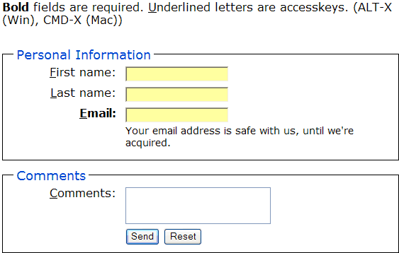
Figure 1: CSS Forms Layout Example (image)
Table-Based Contact Form
First let’s look at the old way of laying out a form. Tables use columns and rows to align labels and input fields (see Figure 2).
<form action="http://www.example.com/submit.cgi" method="post" class="ft">
<table>
<colgroup><col align="right"></col><col align="left"></col></colgroup>
<tr><th colspan="2"><h3>Personal Information</h3></th></tr>
<tr><th>First name:</th>
<td><input type="text" name="firstname" value="" title="first name"><td></tr>
<tr><th>Last name:</th>
<td><input type="text" name="lastname" title="last name"></td></tr>
<tr><th>Email:</th>
<td><input type="text" name="email" title="email"><td></tr>
<tr><th colspan="2"><h3>Comments</h3></th></tr>
<tr><th>Your comments:</th>
<td><textarea name="comments" rows="3" cols="20" title="comments"></textarea></td></tr>
<tr><td></td><td><input type="submit" value="Send"> <input type="reset" id="reset"></td></tr>
</table>
</form>
Note how much of the XHTML code is used for layout. Note also that this is an minimalist example with little or no accessibility features. The resulting table looks something like this rendered in a browser.
Unfortunately, laying out a form with tables can make it difficult to access for folks with disabilities. Table-based layout also lowers your content to markup ratio, which reduces potential SEO rankings and speed. Fortunately there is a better way, CSS layout.
Building a CSS-based Form
The key to any CSS conversion project is to strip down your XHTML to bare structural elements, and then use CSS to contextually target as much style and layout as possible using few embedded classes or IDs. Forms are no different. What the table-based form above is missing are semantic elements the W3C provides in the (X)HTML specifications, namely FIELDSET and LABEL. Although they can be funkily interpreted for background colors, FIELDSET and LABEL give logical order to FORMs. FIELDSET groups like-minded form input fields and LABEL FOR links field labels with input fields through the ID attribute to make them more accessible and eminently stylable. Let’s take the above table-based form code and strip it down to the bare essentials.
<form action="http://www.example.com/submit.cgi" method="post" name="f">
<fieldset>
<legend>Personal Information</legend>>
<label for="firstname" accesskey="f">First name: </label>
<input type="text" id="firstname" name="firstname" value="" tabindex="1">
<label for="lastname" accesskey="l">Last name: </label>
<input type="text" id="lastname" name="lastname" tabindex="2">
<label for="email" accesskey="e">Email: </label>
<input type="text" id="email" name="email" tabindex="3">
</fieldset>
<fieldset>
<legend>Comments</legend>
<label for="comments" accesskey="c">Your comments: </label>
<textarea id="comments" rows="3" cols="20" name="comments"></textarea>
<input type="submit" value="Submit" tabindex="4"> <input type="Reset" tabindex="5">
</fieldset>
</form>
This barebones contact form contains the same fields, but they are now surrounded by semantic markup, not layout. The first FIELDSET groups the personal data together, while the second groups the comment field into one group. This style-free form looks like this (see Figure 2).
Figure 2: Unstyled CSS Form Layout Example (screenshot)
Add CSS Float, mix well
The key to laying out a two-column form is to float the label (and input in some cases) element thus:
form label {
display: block;  /* block float the labels to left column, set a width */
float: left;
width: 150px;
padding: 0;
margin: 5px 0 0; /* set top margin same as form input - textarea etc. elements */
text-align: right;
}
Note that CSS purists may object to the fixed width, attempts at relative widths using ems or percentages were met with browser rendering problems. The above code creates a two column layout using the label and input elements of the above form. Note that for multiple elements placed after one floated label the second and subsequent elements may break left. Since we use only one input element per label, we’re on safe ground here. Later on we’ll show how to indent instructive text to the second “column” with a margin-left command.
Set Form Width
Next we set a width for our form and style the fieldsets. Note how we use the form element to set a min/max width. Unfortunately fieldsets are not rendered identically by different browsers. Backgrounds can overlap, padding doesn’t behave, and they tend to take up the entire width of the screen on Internet Explorer. Auto, ems, and percentages were tried, but the form misbehaved stretching this way and that. A pixel value larger than the largest anticipated font size did the trick, avoiding wrapping. However we chose to set the width using the form element, which bypassed the problem.
form {  /* set width in form, not fieldset (still takes up more room w/ fieldset width */
font:100% verdana,arial,sans-serif;
margin: 0;
padding: 0;
min-width: 500px;
max-width: 600px;
width: 560px;
}
form fieldset {
/ * clear: both; note that this clear causes inputs to break to left in ie5.x mac, commented out */
border-color: #000;
border-width: 1px;
border-style: solid;
padding: 10px;        /* padding in fieldset support spotty in IE */
margin: 0;
}
Bump up Legend Size and Underline First Letter
Next we bump up the legend font size and underline the first letter of our labels to signify our access keys. Note that Firefox 1.07 Win and Explorer 5.2 Mac do not appear to support the first-letter pseudo-class on legend elements. Opera also breaks the legend after the first letter underlined (despite attempts to fix this with white-space:nowrap;, see Figure 3).
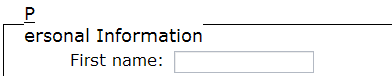
Figure 3: Opera Breaks First-Letter Underlined Legends
Due to these legendary problems (thanks to readers below who pointed the Opera problem out) we switched to underlining the first letter in our labels (form fieldset label:first-letter;) which works on all browsers tested and requires accesskey attributes in each input field.
form fieldset legend {
font-size:1.1em; /* bump up legend font size, not too large or it'll overwrite border on left */
/* be careful with padding, it'll shift the nice offset on top of border  */
}
form fieldset label:first-letter { /* use first-letter pseudo-class to underline accesskey, note that */
text-decoration:underline;    /* Firefox 1.07 WIN and Explorer 5.2 Mac don't support first-letter */
/* pseudo-class on legend elements, but do support it on label elements */
/* we instead underline first letter on each label element and accesskey */
/* each input. doing only legends would lessen cognitive load */
}
Break Clear of the Ordinary
We need to clear our floats somehow, and clearing on the structural elements didn’t work in all browsers tested, so we used a BR element, which also helps our form gracefully degrade for older browsers.
form br {
clear:left;
}
Miscellaneous Tweaks and Workarounds
Indent Instructions to Second Column
To add instructions to the right column you can set a left margin equal to the accumulated indent of the input fields. This is simpler than using a dummy label element.
form small {
display: block;
margin: 0 0 5px 160px; /* instructions/comments left margin set to align w/ right column inputs */
padding: 1px 3px;
font-size: 88%;
}
Dummy Label Element
Speaking of which, we found that the alignment of our submit and reset buttons was more consistent using a dummy label element than a left margin. You can use the above technique to indent these elements but we found the positioning was inconsistent between browsers. We were trying to avoid CSS hacks and browser sniffing so the “kludge” label was the most expedient method (this could be renamed as “submit” for clarity).
<label for="kludge"></label>
<input type="submit" value="Send" id="submit">...
CSS Gotchas
One gotcha to watch out for is in the notoriously finicky IE5 Mac. If you specify display: inline for the input and textarea elements they break left in IE5x Mac (see Figure 4).
form input, form textarea {
display: inline; /* inline display must NOT be set or will hide submit buttons in IE 5x mac */
width:auto;      /* set width of form elements to auto-size, otherwise watch for wrap on resize */
margin:5px 0 0 10px; /* set margin on left of form elements rather than right of
label aligns textarea better in IE */
}
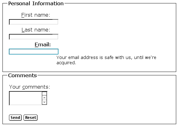
Figure 4: IE5x Mac Breaks Left with Display Inline
Floating Safari Hides Input Buttons
Make sure you test your creation in Safari as well. We ran into disappearing or obscured buttons when floating both labels and input elements (see Figure 5).
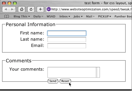
Figure 5: Safari Mac Can Hide or Obscure Buttons
If you do choose to float your inputs, we surmise it is the floats applied to our input buttons, removing floats and displaying inline solved the problem (see code below). We chose to avoid the problem entirely by floating only our labels.
form input#submit, form input#reset {
float: none;
display: inline;
margin:0;
padding:0;
}
Padding the Cellmates
We tried adding padding between the flush right labels and flush left input elements using margins and padding on the right side of our labels. This didn’t work as well as we would have hoped, giving inconsistent positioning on our textarea element. Adding margins to the left of our input and textarea form elements worked more consistently in IE6 Win.
form input, form textarea {
...
margin:5px 0 0 10px; /* set margin on left of form elements rather than right of
label aligns textarea better in IE */
}
The final product can be seen below and in a separate CSS form complete with JavaScript to focus the cursor in the first input element.
Here is the CSS and form code.
<style type="text/css">
<!--
form {  /* set width in form, not fieldset (still takes up more room w/ fieldset width */
font:100% verdana,arial,sans-serif;
margin: 0;
padding: 0;
min-width: 500px;
max-width: 600px;
width: 560px;
}
form fieldset {
/ * clear: both; note that this clear causes inputs to break to left in ie5.x mac, commented out */
border-color: #000;
border-width: 1px;
border-style: solid;
padding: 10px;        /* padding in fieldset support spotty in IE */
margin: 0;
}
form fieldset legend {
font-size:1.1em; /* bump up legend font size, not too large or it'll overwrite border on left */
/* be careful with padding, it'll shift the nice offset on top of border  */
}
form label {
display: block;  /* block float the labels to left column, set a width */
float: left;
width: 150px;
padding: 0;
margin: 5px 0 0; /* set top margin same as form input - textarea etc. elements */
text-align: right;
}
form fieldset label:first-letter { /* use first-letter pseudo-class to underline accesskey, note that */
text-decoration:underline;    /* Firefox 1.07 WIN and Explorer 5.2 Mac don't support first-letter */
/* pseudo-class on legend elements, but do support it on label elements */
/* we instead underline first letter on each label element and accesskey */
/* each input. doing only legends would  lessens cognitive load */
/* opera breaks after first letter underlined legends but not labels */
}
form input, form textarea {
/* display: inline; inline display must not be set or will hide submit buttons in IE 5x mac */
width:auto;      /* set width of form elements to auto-size, otherwise watch for wrap on resize */
margin:5px 0 0 10px; /* set margin on left of form elements rather than right of
label aligns textarea better in IE */
}
form input#reset {
margin-left:0px; /* set margin-left back to zero on reset button (set above) */
}
textarea { overflow: auto; }
form small {
display: block;
margin: 0 0 5px 160px; /* instructions/comments left margin set to align w/ right column inputs */
padding: 1px 3px;
font-size: 88%;
}
form .required{font-weight:bold;} /* uses class instead of div, more efficient */
form br {
clear:left; /* setting clear on inputs didn't work consistently, so brs added for degrade */
}
-->
</style>
<script>
<!--
function sf(){document.f.firstname.focus();}
-->
</script>
</head>
<body onLoad=sf()>
<form action="#" method="post" name="f">
<p><b>Bold</b> fields are required. <u>U</u>nderlined letters are accesskeys.</p>
<fieldset>
<legend>Personal Information</legend>
<label for="firstname" accesskey="f">First name: </label>
<input type="text" id="firstname" name="firstname" tabindex="1" value="" title="first name"><br>
<label for="lastname" accesskey="l">Last name: </label>
<input type="text" id="lastname" name="lastname" tabindex="2" title="last name"><br>
<label for="email" class="required" accesskey="e">Email: </label>
<input type="text" id="email" name="email" tabindex="3" title="email"><br>
<small>Your email address is safe with us, until we're acquired.</small>
</fieldset>
<fieldset>
<legend>Comments</legend>
<label for="comments" accesskey="c">Comments: </label>
<textarea name="comments" rows="3" cols="23" id="comments" tabindex="4" title="comments"></textarea><br>
<label for="kludge"></label>
<input type="submit" value="Send" id="submit" tabindex="5"> <INPUT type="reset" id="reset" tabindex="6">
</fieldset>
</form>
Multicolumn Forms
More complex forms can be done with CSS, with similar techniques used for 3 and 4-column layouts. You can float notes and additional columns within this framework.
Conclusion
With careful use of CSS and lots of browser testing you can create two or three-column forms using CSS layout. Be sure to test your creation in as many browsers as possible (you can use Browsercam as well). We found that designs that worked well in some browsers would break in others (especially IE 5.x Mac). By marking up your forms with structural elements and targeting those elements with CSS contextual selectors you can create a fast-loading form that is SEO friendly and accessible.
Further Reading
- Accessible Forms
- A succinct tutorial on the elements of accessible forms by Roger Hudson.
- Accessible Forms: Guidelines, examples, and accessible JavaScript tricks
- A list of form guidelines based on web standards and current accessibility guidelines from websemantics.co.uk.
- Belorussian Translation of this article
- provided by ucallweconn with permission.
- CSS-only, Table-less Forms
- Jeff Howden’s take on CSS form layout. Uses DIVs to group labels and form inputs rather than breaks.
- CSS2 – Tableless Forms
- Peter-Paul Koch’s version uses cleared breaks, the technique shows in this page uses the cleared break technique for brevity and backwards compatibility.
- Form Layout with CSS: A Small Literature Study
- Bobby Vandersluis surveys different form layout techniques and offers some commentary re XFORMS and further reading.
- Hackett, S., Parmanto, B. and Zeng, X. (2003), “Accessibility of Internet Websites through Time,”
- In a wayback machine study of 154 unique websites from 1997 to 2002 Hackett and company found that random websites have become progressively less accessible and more complex over time. Government websites have also become more complex over time, but have maintained their accessibility (in part because they are required by law to do so). The researchers conclude that added webpage complexity (scripts, animation, Flash etc.) inadvertently creates barriers to accessibility for users. In ACM SIGACCESS Conference on Assistive Technologies,
Proceedings of the 6th international ACM SIGACCESS conference on Computers and accessibility, Atlanta, GA, USA, pp. 32 – 39. - How to Style forms in CSS
- Author Jason Teague shows how to style forms with CSS in this multi-part article.
- Introduction to Web Accessibility
- Resources from the W3C.
- Ivory, M. and Megraw, R., (2005), “Evolution of Web Site Design Patterns,”
- In a longitudinal study of highly rated web sites from 2000 to 2003 Ivory and Megraw found that the “most glaring deficiency of web sites, even for sites that are highly rates, is their inadequate accessibility, in particular for browser scripts, tables, and form elements.” ACM Transactions on Information Systems, v. 23:4(2005):463-457.
- Loiacono, E. (2004), “Web Accessibility of Corporate America,”
- Loiacono found that less than 20% of Fortune 100 websites are fully accessible to people with disabilities. In Communications of the ACM, v. 47:2, pp. 82-87. Dec. 2004.
- Online Accessibility: Forms
- Form accessibility tutorial from the accessibility lab at Michigan State University.
- Real-World Style
- This example uses spans and divs, omitting structural form markup, not recommended.
- Simply Accessible
- A brief presentation on designing accessible forms by Derek Featherstone.
- Sullivan, T. and Matson, R. (2000), “Barriers to use: Usability and content accessibility on the web’s most popular sites,”
- Found that more than half of the web’s 50 most popular websites were partly accessible or inaccessible. In Proc. of CUU’00, pp. 139-144, ACM Press, 2000.
- Techniques for User Agent Accessibility Guidelines
- Includes accessible form techniques from the W3C.
Great information, Andy! Very thorough analysis.
Mike,
Thanks. I changed the tabindex as you mentioned to not conflict with Movable Type’s tabindex, so tabbing through the comment form won’t jump around as before, thanks.
– Andy
Good tutorial 🙂
A really minor point, you can slim down a few of your CSS selectors a little:
form fieldset -> fieldset
form fieldset legend -> legend
form label -> label
form input, form textarea -> input, textarea
The reason being, fieldsets can only ever appear in a form so “form fieldset” is unnecessary, likewise the other rules.
Richard,
Thanks for your comments, good point. This is true if I didn’t have any other forms on the page, but as I found out this morning the other forms are affected without specifying a class for the form. The Movable type form got a bit funky from the general type selector styles, so I added a class like this:
form.fc fieldset…
If all I had was one form on the page, what you suggest would trim the CSS.
– Andy
Nice job, been looking for a good way to create my forms.
Great article
Nice article. However, I’m still not convinced that CSS is that great. Your table-layout example amounted to approximately 716 characters (no spaces), in 24 lines of code. The CSS implementation amounted to approximately 2,817 characters (no spaces), in 122 lines of code.
Yes, separation of content and design is good. Yes, we all want better SEO. Yes, CSS provides flexibility. Let’s say you like the table-layout and are content with it. Why use CSS when it is 393% bigger in code size?
Just curious what your thoughts are on this.
Have you considered using a definition list to achieve the same results?
The reason I don’t style the labels (or forms) is because when you work with web applications and things get coded, sometimes the labels get included with the code and thus won’t read. So, I discovered this fool-proof way to style a form.
For example:
CSS Code
fieldset {width: 50%; border: 1px dotted #666699; padding: 10px; text-align: left;}
legend {font-size: 140%; font-weight: bold; background-color: #666699; color: white; padding: 2px 4px;}
dt {float: left; clear: left; width: 25%; padding: 5px; text-align: right; font-weight: bold; color: #666699;}
dd {text-align: left; padding: 5px;}
textarea {font-family: Verdana, Arial, Helvetica, sans-serif; border: 1px solid #666699; padding: 2px;}
.input {border: 1px solid #666699; padding: 2px;}
.btn {background-color: #666699; color: #fff; padding: 4px; font-size: 110%; font-weight: bold;}
HTML Code
<div align="center">
<form>
<fieldset><legend>Contact Me</legend>
<p>Please fill in the fields below.</p>
<dl>
<dt><label for="name">Name:</label></dt><dd><input type="text" class="input" size="25" id="name" /></dd>
<dt><label for="email">E-mail:</label></dt><dd><input type="text" class="input" size="25" id="email" /></dd>
<dt><label for="message">Message:</label></dt><dd><textarea cols="30" rows="3" id="message">Leave your message here.</textarea></dd>
</dl>
<p align="center"><input name="Submit" type="submit" class="btn" value="Send" /></p>
</fieldset>
</form>
</div>
Dear Guest,
Good point, although I don’t think you are comparing apples to apples. The table code doesn’t have all the accessibility features that the CSS-based code has, this would bulk it up. The table example is a minimalist one, and shows that much of the markup is non-semantic, just used for layout. The CSS-based markup is mostly semantic markup (except for the BRs), which is easily targeted with CSS (no comments needed in production code as well).
The table code is also pretty much unstyled, this would bulk it up as well. If we were to add accessibility code in (label/fieldset/accesskey etc.) and add in CSS to style the table code to look like our CSS example it would be closer.
Also, we could use the CSS for other forms that are marked up in a similar way, rather than relaying them out with another table, which saves space. So this takes the layout out of the code, and puts it into the style sheet. This is good for speed, seo, accessibility, and maintainability.
– Andy
Kristy,
Aha! Interesting idea, similar to my Bookend Lists technique I talked about last time. Use the DT to float left and the DD for the inputs. No need for the BR since you clear:left on the DT. Nice.
– Andy
Nice article. Lots of useful stuff. My essential weekend read (sad I know but…)
Just a thought. I use a combination of css and javascript to change the look of an input box so that when it is in focus it changes colour (see http://www.accountancymagazine.com/springoffer/ ).
Does anyone out there have a view on whether this aids in form filling? (I’m interested because from my observations people find forms a tad confusing and are almost looking for an excuse to abandon them).
Alex
Nice work Andy!
Learned something new today.
Andy, nice article
you might want to consider using button type=”submit” instead of input type=”submit” it should solve the IE 5.23 on Mac problem, makes forms a tiny bit more accessible (you can not increase the text size on an input type=”submit/reset/button” in Safari above 13px) and gives you more control over the appearance of forms.
The button element was introduced in HTML 4 to give more styling options to HTML forms, I only rediscovered the button element a couple of months back. A little more information can be found on the presentation I gave to the Perth (Western Australia) Web Standards Group a few days ago. I really need to do an in-depth article.
Nick
Nick,
Good idea on the buttons, I’ll see if I can play with these for an update. Thanks for the preso as well.
– Andy
The legends break in Opera. After underlining the first character of the legend a line break is introduced.
Hm – you might want to check it out in Opera – the “P” and “ersonal” are on different lines for some reason.
Andy and Jonathan,
Good catch on Opera breaking first-letter underlined legends. I added a screen shot of Opera breaking a legend, switched to underlining the labels to signify accesskeys, and it worked in all browsers tested, including Opera 8.53 Win.
Also updated the example form (reload it to see latest version). Thanks again.
– Andy
Is it necessary to have both “First name” and “Last name” fields? Why not just “Your name”. And get rid ot that “Reset” button – it has no use.
purely relying on styling to denote required fields goes against accessibility tenets. what happens if styles are not displayed? what about screen reader users?
How is making the Email label bold accessible? A screen reader user will not know that field is required before they try submitting it.
Very deep analysis. I need 1 hour to just understand everything. Thanks.
Very nice article,
Though I have issue with the use of bold to mark required fields. Maybe consider using <strong> elements in the (X)HTML instead? I’ve been told that strong items have different intonation with screen readers, though I couldn’t hear it myself.
There are quite a few accessibility issues with this solution, but it goes a long way to solving others. One usability point, the ID for the example form e-mail field seems to be the same as the one used in this comment form. It’s worth bearing in mind that an ID can only be used once on a page. Clicking in the example form brings the focus immediately to the live comment form at the bottom of the page.
Great work – thank you! One small error: you set accesskey=”c” for both the comments field and the reset button.
I’m working on an update to this article that addresses the issues raised above (underline first letter, bold for required fields etc) that follows IBM’s new accessibility guidelines. Stay tuned…
Great article on CSS forms and layout. I’ve searched the web for many topics like this and I do have to commend you on such a thorough analysis. One question I do have though is if the “form .required{font-weight:bold;}” line is accessible to screen readers for them to tell what fields are required? Thanks.
I want to create a form action
Wow, you have done a awesome job with your blog !
Very nice article! How would you incorporate a group of radio buttons or checkboxes in your form?
I notice that your layout doesn’t quite work if the labels get any longer than 150px – then the note (“your email is safe…”) below the label/field pair gets pushed down below the label. I’ve been trying to find a solution to this problem for my own CSS-based form. Any ideas?
Great article! thanks.
But, can anybody help me with css buttons?
How I can change standard input buttons?
Thanks.
James Carlos makes a very good point that was apparent right away…the table based code is far shorter. Has anyone around here done basic comparisons between CSS and Tables where everything is exactly the same except the layout strategy? I’ve done a few, and it generally works out that the table based layout is quite smaller (and it works in all browsers without any fuss!).
I agree that you can use the stylesheet for other forms, but generally I end up modifying the styles for each sheet anyways, so that doesn’t seem to be too strong of an argument. For all of the bug fixes, cross-browser issues and longer code (in most cases), is CSS really that great?
Excellent tutorial…i agree, strong should be used inside label tags to designate required fields (for accessibility). Given the complexity of your backend, you can still trigger this by grepping the DOM for “.required” elements, and insert strong.
I also am curious how you handle errors? In the past I had notes underneath the label, and the small block on the right was used for errors.
I’m incorporating some of your suggestions into my dummy form.
See http://utuxia.com/request for a working example.
One last issue I have is that input fields are not vertically centered with longer labels wrapping multiple lines.
How can you style a row of small fields?
Label1 Label2 Label3
Field1 Field2 Field3
Any suggestions or reference articles appreciated.
We’ve used a similar strategy for forms for the last 4 years where I work. Our intranet app started out as a table based layout. It was a maintenance nightmare every time clients asked for a change. Then I found a similar article at A List Apart and moved away from tables for layout. I can’t say enough about how well it’s worked out.
Two years ago we did a full site redesign which changed the look and feel of 167 pages. The change took less than 120 hours to design, implement, and test, and only required changing 3 css files.
We still use tables for specific needs (e.g. tabular data views.)
It worked for us because of our target audience and goals. We need to be able to put product changes in monthly to a limited audience (15,000 people). The changes need to retain the same look and feel as the rest of the application and every couple of years we need to refresh the design without expending a great amount of money and effort (i.e. new clients, new browsers, new UCD trends, new knowledge of our users habits).
As with any approach you have to do the cost benefit analysis. The CSS approach may or may not save you bandwidth and coding depending on the complexity of your needs and your target audience.
We found benefits in maintenance cost to our app and flexibility when changes were required. By going with CSS and a well defined HTML structure to match we allowed our development staff to focus more on functional coding and leave our specialists to doing the design and layout work.
Your mileage may vary.
About floating your labels globally, have you encountered any issues with the difference between labels for your form inputs and other types of inputs like radio and checkbox? I suppose a global label floated left, and the instance specific labels (radio, cbox) can be classed for their specific uses.
Any thoughts?
I’m attempting to tweak this solution so I can include arrays of radio buttons or checkboxes. Basically, I’m putting the array in a and styling that. This way I can add as many as I need and they’ll wrap and align nicely. Just 1 problem, the first radio button (top “row”) does not align, it’s 3 pixels off. Any thoughts?
.rbblock {
margin: 0 0 5px 150px;
padding: 0px;
background-color: #99CCCC;
}
Option A
Option B
Option C
Option D
Option E
Whilst I’m not against CSS, it amazes me that people talk about the efficiencies of CSS when your example here clearly shows that what could be done in 18 lines of HTML using a two-column table, needs 100 lines of XHTML and CSS, introduces numerous quirks and issues, and becomes a lot less linearly readable.
Hm. A lot of bugs to handle with and lots of naughty hacks to get a simple form look like a table. I would prefer tables to style elements to look and behave like tables.
Folks with disabilities needs well structured markup – you also can create a well structured and accessible document with tables. Reducment of SEO rankings and speed are a bold statement, can you prove this?
Wow – thanks millions for this. I really wanted to keep nicely-structured markup without a lot of extra divs and this does it nicely.
excellent article for developing such forms in css. I tried many times to get up fresh things in css. But this article helps me so much..
Thanks dude…
The problem with these XHTML standard form designing shows good in some browsers and on some worst. The article is good for beginners and helps a lot.
first of all thanks for taking the time to write such a good resource for everyone 🙂
but i’m missing a decent debate about the semantics: how to properly break lines in a form? you and (beloved) ppk chose the BR approach. i went for a quite deep search along the web and found out that all who claim to be semantic and accessible use either one of these:
my personal opinion is in favor of P:
i would really like to read other people opinions!
Hey Nice technique, this is what i was searching since long time. But, when i tried to use this, and on submit, i wanted to display some errors below the box. Unfortunately the error came to next line instead of below the text box. Anyway i use some trick to fix that. overall its really useful resource
Thanks,
Andy, thanks so much for a great article! There is one little thing that is bothering me. As soon as we add CSS for right aligning the labels, the baselines are messed up – the label is no longer aligned with the input. The difference is more noticeable for larger fonts. Any idea how this can be fixed? I stripped down the CSS to a minimal amount to demonstrate the problem. Here it is:
body, input {
font-family: Arial, Verdana, Helvetica, sans-serif;
font-size: 24px;
}
form label {
display: block;
float: left;
width: 200px;
padding: 0;
margin: 5px 0 0;
text-align: right;
}
form input, form textarea {
width:auto;
margin:5px 0 0 10px;
}
Here’s my test example:
I would really appreciate your thoughts on this.
Thanks.