
An overlay is when one web object overlaps another. Overlays are often used to highlight or draw attention to important items on websites to raise conversion rates. This article shows how use CSS positioning to avoid slicing and dicing your overlays and assembling with tables. Along the way we’ll look at the workarounds we used to make the technique work with different browsers (most importantly IE5.x Mac and Safari).
CSS Overlays in Action
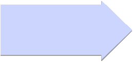
First let’s look at the final product. Figure 1 shows an arrow on the left overlaid on top of the image on the right. The arrow is one image with a drop shadow, shifted to the right to overlay the image on the right. In fact the entire left column is shifted to the right.

Figure 1: St. Lawrence Overlay
A peaceful morning in the St. Lawrence is broken only by the gentle call of the loon. This effect shows a blue arrow overlaying a blue-toned scene with a canoe seemingly floating in space.
can create a peaceful
scene like this with
fewer HTTP requests
no slicing required!
Two-Column Layout Revisited
To create our overlay first we start with a two-column layout in CSS:
.floatl{float:left;}
.floatr{float:right;}
.widthr{width:459px;}
.widthl{width:259px;}
...
<div class="center">
<div class="main left">
<div class="floatr widthr">
<img src="canoe459x310.jpg" width="459" height="310" alt="canoe in st lawrence" />
</div>
<div class="floatl widthl">
<p>Text goes here</p>
<div><img src="arrow-drop.gif" width="259" height="122" alt="arrow with drop shadow">
</div>
</div>
</div>
</div>
This creates a two-column layout that works in Windows (IE6, Opera 8.53, and Firefox 1.07) and Mac (Safari). Mac IE 5.x is notorious for its partial and buggy support of CSS, and we find using absolute positioning to be the only way to make IE Mac behave. We’ll address that later in this tutorial. Note that you must specify a width for the right DIV or Safari breaks this layout.
Creating the Overlay
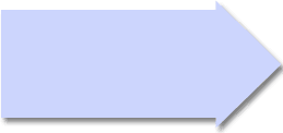
Next we create the overlay by shifting the left column to the right, to overlap the arrow top on top of the image in the second column. To do this we add a class on our left DIV of “bumpright” which uses relative positioning to bump the column to the right. While we’re at it we’ll narrow the textual part of our left column so the shift won’t overlap the text.
.floatl{float:left;}
.floatr{float:right;}
.widthr{width:459px;}
.widthl{width:259px;}
.width230{width:230px;}
.bumpright{position:relative;left:17px} /* mac ie5.x doesn't like position relative */
...
<div class="center">
<div class="main left">
<div class="floatr widthr">
<img src="canoe459x310.jpg" width="459" height="310" alt="canoe in st lawrence" />
</div>
<div class="floatl widthl bumpright">
<div class="width230">
<p>Text goes here</p>
<div><img src="arrow-drop.gif" width="259" height="122" alt="arrow with drop shadow">
</div>
</div>
</div>
</div>
</div>
Which looks like this.
Text goes here
Halo around Dropshadow
Note the halo of white anti-aliased pixels around the tip of our drop-shadowed arrow. The trick to avoid this is to create a non-antialiased monochromatic drop-shadow.
Overlay Text on the Overlay
Now we can overlay some text on top of our drop shadowed arrow. We do this by adding a block of text below our arrow, and bumping it up with relative positioning. We also create another class “up” to bump up the content that follows. Note that Mac IE5.x doesn’t like relative positioning, so we zero it out later using conditional CSS.
.up{position:relative;top:-70px;}
.position2{position:relative;top:-105px;left:10px;text-align:left}
...
<div class="position2 bold red medium">
CSS Overlays<br>can create a peaceful<br>scene like this with<br>fewer HTTP requests<br>no slicing required!
</div>
Dealing with IE5.x Mac
If your client requires compatibility with IE 5.x Mac, you have some more work to do. Internet Explorer Mac (5.1 and 5.2 at least) doesn’t fully support multiple floats and some relative positioning. My best advice is test your creations on different browsers and try different things. I used variations on the Tantek hack to hide some offending styles from IE 5.x Mac, and only show IE5.x-friendly styles to IE5.x Mac (namely absolute positioning). By adding another class to our left column (position3) to absolutely position this column and nullifying the “floatl,” we effectively toggle the float left off, and absolutely position the column for only IE 5.x Mac.
/* ie5 mac positioning styles must be absolute, tantek hack follows */
/* Hide from IE-Mac \*/
.up{position:relative;top:-70px;}
.up2{position:relative;top:-80px;}
/* End hide */
/*\*//*/
.position3{position:absolute;top:265px;left:108px;}
.up{margin-top:0em;}
.up2{margin-top:0em;}
.floatl{};
/**/
<div class="floatl width259 bumpright position3">
The final code works in all version 5 browsers tested.
<style type="text/css">
<!--
.main3{width:718px;margin-left:auto;margin-right:auto;text-align:left}
.center{text-align:center}
.floatr{float:right}
.floatl{float:left}
.left{text-align:left}
.width459{width:459px;} /* must have width to work in safari */
.width259{width:259px;}
.width230{width:230px;}
.bold{font-weight:bold}
.medium{font-size:14px}
.position2{position:relative;top:-105px;left:10px;text-align:left}
.red{color:#a52742;}
.clear{clear:both;}
.bumpright{position:relative;left:17px} /* mac ie5.x doesn't like position relative */
.bumpup{margin-top:-5px;margin-bottom:4px;} /* for plus image to bump up to align w text and gap below */
/* ie5 mac positioning styles must be absolute, tantek hack follows */
/* Hide from IE-Mac \*/
.up{position:relative;top:-70px;}
/* End hide */
/*\*//*/
.position3{position:absolute;top:265px;left:108px;}
.up{margin-top:0em;}
.floatl{};
/**/
-->
</style>
<div class="center">
<div class="main3 left">
<div class="floatr width459">
<img src="canoe459x310.jpg" width="459" height="310" alt="canoe in st lawrence" />
</div>
<div class="floatl width259 bumpright position3">
<div class="width230">
<h5>Figure 1: St. Lawrence Overlay</h5>
<p>A peaceful morning in the St. Lawrence is broken only by the gentle call of the loon.
This effect shows a blue arrow overlaying a blue-toned scene with a canoe seemingly floating
in space.</p>
</div>
<div><img src="arrow-drop.gif" width="259" height="122" alt="arrow with drop shadow">
</div>
<div class="position2 bold red medium">
CSS Overlays<br>can create a peaceful<br>scene like this with<br>fewer HTTP requests<br>no slicing required!
</div>
</div>
</div>
</div>
</div>
Conclusion
With careful use of CSS and some workarounds for IE 5.x Mac you can make CSS overlays work for modern browsers. CSS overlays use positioning to shift web objects vertically and horizontally to overlay other objects for a layered effect. Be sure to test your creation in other browsers.
Did you check this page in IE 6?
Doesn’t look to hot. Your arrow is off.
Pretty basic stuff and you could have used a more interesting example to really highlight the advantages of this technique.
Sorry, Your example is fine on Firefox I meant Internet Explorer. The second arrow image is shown just below the title ‘Two-Column Layout Revisited’ I’m using MSIE 6.0
https://www.websiteoptimization.com/speed/tweak/overlay/ on IE 6.0.2900.2180.xpsp_sp2_gdr.050301-1519.
Is this page a joke or what? I’m scrolling down to where it says Two Column Layout Revisited, and bam, there’s the blue arrow (and a line that says text goes here, overlaying the html that’s supposed to be showing me how we start with a two column layout. I’m looking for something that indicates that this is an example of what not to do, but I don’t see it. So much for a fix.
This is a good tutorial. Is there anyway to do this vertically. For example, make value 2 overlap value 1 and 3?
Value 1(This is the banner div)
Value 2(This is the menu div)
Velue 3(This is the mainbody div)
i don’t know were to paste the overlay layouts code were in css or media box i don’t understand
This doesn’t work if your screen window size is too wide. The arrow jumps below the picture. Would putting the whole thing inside a table with specified table width help? I think so.
I’ve got an oddball idea I need help with. We use an online database that has a set of buttons (tabs) and we don’t like what the tabs are named. Is there a way to put an overlay that just sits in the browser window over top of the tabs, only while the window is open on our local machine? I’m not trying to code anything into the database, because we don’t own it, we just subscribe to it. So I guess my question is – can I make a set ob tabs in Illustrator or Photoshop, and just pull them over into my browser while I’m working on that page?