
WebsiteOptimization.com was designed by the author in 2002, in the age of slower dial-up modems. The design was starting to show its age, so we’ve been quietly working on a redesign to improve the look and conversion rate. This article shows how we redesigned the site, and some of the techniques we used to achieve our goals.
WebSiteOptimization.com Redesign
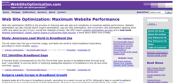
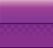
The original 2002 design has evolved from a static site with server-side includes to a blog-based site using Movable Type. Designed for speed, the previous design was fast to load at only 16.5K and 4 HTTP requests (see Figure 1).
Figure 1: WebsiteOptimization.com Original Design Circa 2008
The New Design of WebsiteOptimization.com
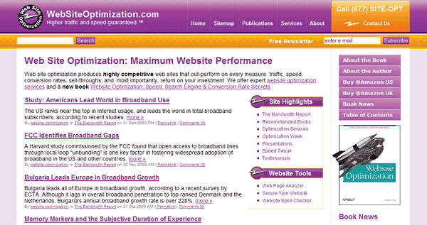
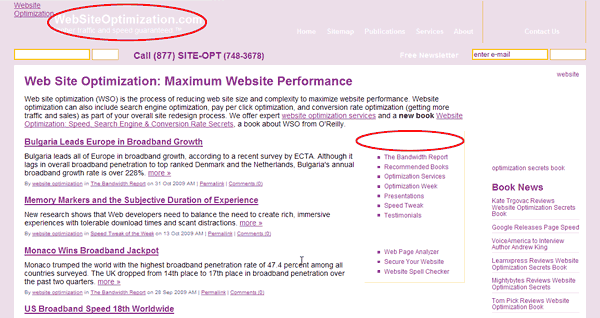
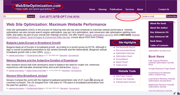
The new design of WebsiteOptimization is shown in Figure 2. Our goals for this redesign were to update the site for a more modern, three-dimensional look, clean up the code, eliminate the use of tables, and integrate Movable Type more fully into the site. The new design is 72.2K with 16 HTTP requests.
Figure 2: WebsiteOptimization.com New Design Circa January 2010
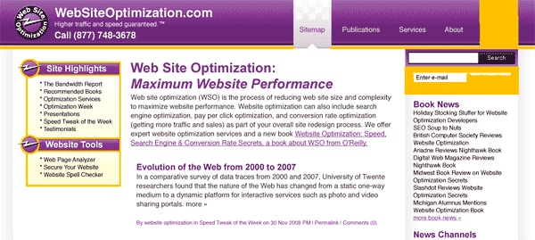
An early iteration of the new design shows the direction we were taking (see Figure 3).
Figure 3: WebsiteOptimization.com Early Iteration of New Design Circa January 2009
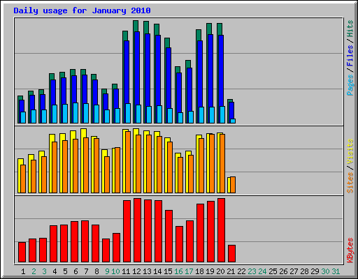
The new design launched on January 11, 2010. After ten days the statistics show the jump in files and kilobytes used (nearly 100% for files). The number of visits actually increased slightly with our low-profile launch so the heavier design appears to positively affect visitation (see Figure 4).
Figure 4: WebsiteOptimization.com Daily Visitation Statistics January 21, 2010
CSS Sprites
We used CSS sprites to save HTTP requests in the rollover menus (see Figure 5). The three CSS sprites save three HTTP requests.
 |
 |
 |
| Sidebar CSS Sprite | Navigation Bar Contact Rollover Sprite | Navigation Bar Rollover CSS Sprite |
A snippet of code from the stylesheet shows the technique. First we show the default state of the purple menu rollover (see below). On rollover (#nav a:hover) we shift the Y position up by 83 pixels to show the lighter purple rollover state.
    #nav a {
float:left;
display:block;
background:url("/img/nav-tab.png") no-repeat left top;
padding:50px 10px 14px;
color:#fff;
text-decoration:none;
font-weight:bolder;
}
/* Commented Backslash Hack hides rule from IE5-Mac \*/
#nav a span {float:none;}
/* End IE5-Mac hack */
#nav a:hover span {
color:#000;
}
#nav a:hover {
background-position:100% -83px; /* shift up to show rollover */
border-right:1px #501259 solid;
}
Conversion Rate Optimization
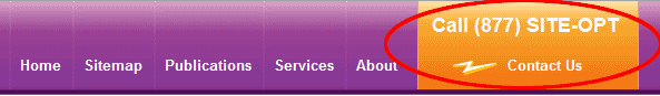
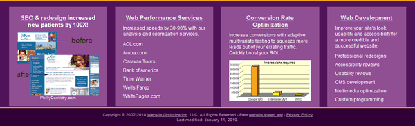
To improve conversions we used best practices to highlight the contact button and placed our 800 number in the upper right-hand corner of the screen where it is easily found and users expect it to be (see Figure 6). Although the new design launched only recently (Jan. 11, 2010) we’ve already noticed at least a 50% increase in phone calls.
Figure 6: Highlighted Contact Us Button with Phone Number
Accessibility
We wanted to ensure that our new design was accessible. The old design was legible with images turned off (see Figure 7). With only two functional images (the logo and book cover), the design is easily read.
Figure 7: Images off with Old Design

When we tested turning images off for the new design, some of the text was difficult or impossible to read (white on white, see Figure 8).
Figure 8: New Design with Images Turned Off Before Fixes
Note that the “Site Highlights” and “Website Tools” headers are invisible on the test version of new design (see Figure 8). Without specifying a background color as a backup for when images are turned off, the white headline blends into the white background. To make the text more legible, we changed the background declaration from only specifying a background image to also specifying a background color. Here is the original CSS for the highlight box:
.ctabox h2{
padding:8px 0 0 55px;
width:137px;
height:34px;
background:url(/img/bolt-top.png) top left no-repeat;
color:#fff;
margin:0;
}
By adding a similar background color as a fallback, the headline is now legible even with images turned off (see Figure 9).
.ctabox h2{
padding:8px 0 0 55px;
width:137px;
height:34px;
background:#501259 url(/img/bolt-top.png) top left no-repeat; /* abk added background color for noimg legibility of white text */
color:#fff;
margin:0;
}
Figure 9: Images off with New Design After Background Fixes
Always set a contrasting background color when specifying a foreground color, to ensure accessibility. Note that the Free Newsletter link is still low contrast after the background fix, but is still legible.
Web Standards Compliance
The new design validates using the W3C’s Markup Validation Service. Using standards-based code has a number of advantages, including faster load times (with CSS text-based navigation), improved accessibility, higher potential search engine rankings, and faster browser render times. Using DIVs instead of tables also allows easier layout and style changes using CSS.
New Footer with Highlights
To integrate the design at the bottom of the page we developed a new footer (see Figure 10). The footer is used to highlight news, case studies, and services with separate boxes for each. We originally used a background image to create the purple boxes, but converting to styled containers saved another HTTP request.
Figure 10: WSO Footer with Highlights
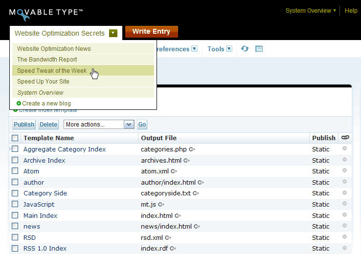
Movable Type Integration
To more easily maintain and update the site, we converted most of the site over to Movable Type (see Figure 11). Movable Type makes it relatively easy to add additional blogs and channels. As you can see we are working on adding a news channel to the site.
Figure 11: Movable Type Interface
The Fun Factor
Our designer added some playfulness to the design by strapping a jetpack on the back of our nighthawk on the cover shot of the author’s book, Website Optimization Secrets (see Figure 12). So far we’ve received no objections from the publisher O’Reilly.
 |
 |
| Original Book Cover | Jetpack Book Cover |
Conclusion
Redesigning your site can improve conversions and perceived credibility. We found that the number of leads increased immediately after we launched the new design. Test your design in different browsers, and try turning images off to test accessibility. There is still work to be done, however. Next we plan to continue speed optimizing the new design.
Further Reading
- Combine Images to Save HTTP Requests
- Learn how to reduce the number of HTTP requests required by your web pages by combining adjacent images and optionally imagemapping the links. This tutorial shows both client and server side techniques you can use to save precious HTTP requests and speed up your site.
- Cut the Comments
- Eliminating comments within your HTML, CSS, and JavaScript code helps optimize your web pages for maximum speed.
- CSS Sprites: How Yahoo.com and AOL.com Improve Web Performance
- Learn how AOL and Yahoo! use CSS sprites to improve performance for their busy home pages. CSS sprites save HTTP requests by using CSS positioning to selectively display composite background images. To maximize accessibility and usability, CSS sprites are best used for icons or decorative effects.
- Minimize HTTP Requests
- By combining external files and embedding CSS and JavaScript within your HTML you can minimize the number of HTTP requests required to render your page. Each unique HTTP request requires a round trip to a server, introducing indeterminate delays.