
The first Velocity Web Performance and Operations conference held in New York City ran from October 14-16, 2013. In its sixth year, Velocity is a conference devoted to testing and speeding up websites. Co-founded by Steve Souders, of YSlow and Page Speed fame and now with Google, attending Velocity is a great way to stay up to date on the latest performance trends, include mobile performance. This article gives some highlights from the conference.
Mobile Performance is Big
Mobile web site performance is so important it has its own “track” with mobile-specific talks and tutorials. With mobile share increasing (30-40% of visitors in some cases) many of the talks covered both desktop and mobile performance issues. One thing is clear, mobile sites are getting fatter and slower. In a 2013 test, 72% of mobile websites were about the same size as desktop, 22% were smaller, and only 6% were much smaller (Responsive Responsive Design, see Figure 1).
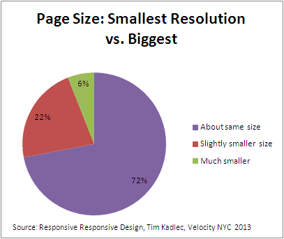
Figure 1: Page Size Mobile vs. Desktop
71% of users expect mobile sites to be as fast or faster than desktop sites. Problem is, mobile sites are getting bigger. In March 2012 the average mobile site was 829K, in March 2013 it was 1031K. Yet to be usable you need an above the fold payload of 65-100K to load in under 10seconds on a slow cellular connection.
Problems with Hiding Elements in Mobile
The problem is that there is no one-size fits all method to hide or down-resolution images and multimedia in CSS. Using display:none; doesn’t show elements, but browsers download them anyway (at least with display:none; assigned to the element itself). Visibility:none; works the same way. The trick is to apply the visibility/display to the parent element, then the resource will not load on mobile devices. So even though a mobile site looks smaller, it actually loads the same content as the desktop site if you rely on display:none to hide your full-sizes images.
@media Rules
There are JavaScript workarounds to avoiding downloads, but the preferred method is using @media rules. With background images the @madia sets a desktop image for browsers greater than 600 pixels wide, and a mobile image for browsers up to 600 pixels wide.
@media all and (min-width: 601px) {
#test {
background-image:url('images/test5-desktop.png');
width:200px;
height:75px;
}
}
@media all and (max-width: 600px) {
#test {
background-image:url('images/test5-mobile.png');
width:200px;
height:75px;
}
}
<div id="test"></div>
Regular foreground images are more problematic. Currently there is no way to display alternative images without JavaScript. A few possibilities are picture, srcset, and LQIP:
<picture width="500" height="500">
<source media="(min-width: 45em)" src="large.jpg">
<source media="(min-width: 18em)" src="med.jpg">
<source src="small.jpg">
<img src="small.jpg" alt="">
<p>Accessible text</p>
</picture>
<img src="low-res.jpg" alt="" srcset="high-res.jpg 2x">
<img
src="dummy.400x300.jpg"
alt="Responsive Image"
data-fullsrc="dummy.800x600.jpg"
/>
Tim Kadlec went on to say that 66% of page weight in mobile sites are images. Some responsive image optimization strategies:
- Compress lossless and lossy</li
- Show not, waste not (display none useless if not on parent element)
- Make sure images right size and resolution
- On average 72% of image weight wasted on small screen
- 60-80% of images are too large on mobile
- Memory usage: 4 bytes/pixel, scale large memory
- Scrolling performance hit with large resized images (memory)
Solutions
- Picture element
- Polyfill
- Srcset
<img src=”low-res.jpg” alt=”” srcset=”high-res.jpg 2sx”> - LQIP (low quality image placeholder)
<img src=”dummy.500×300.jpg”
alt=”responsive image”
data-fullsrc=”dummy.800×600.jpg”
/>
Most Entertaining Talk at Velocity
Jake Archibald (Google) gave the most entertaining talks. “What Your Browser Does When You Aren’t Looking”
showed code examples loading resources with an audience quiz with live speedometer feedback on what actually happened in different browsers.
Prebrowsing
Steve Souders gave a good talk on “prebrowsing” a term he coined and has the domain for. Studies have shown that preloading / lookahead techniques speed up browsing by 20%.
Mobile Website Testing
There was much emphasis on mobile website testing (see some urls in the further reading section below). Andy Davies and Sergey Chrnyshev of showslow fame gave a hands-on web performance workshop showing various mobile performance testing techniques and tools.
Mobile testing whistle-stop tour
- Mobitest agent – jailbreak iphone/ipad – using ui webview
- Mihtool – http://www.iunbug.com/mihtool waterfall china – only ipad
- Httpwatch – Simon Perkins both ipad/iphone
- TCPdump – new no dev tools devices
- Harwatch
Miscellaneous Tips
Async and defer atrribute for scripts, combine everything (JS) into one file and use ASYNC attribute. Move print.css to the end of the body to avoid blocking in IE<9 (against specification, people get content faster in IE8). Web fonts block rendering (we’ve also found that external web fonts can cause significant slowdowns, use built-in fonts instead). For JavaScript libraries, “go vanilla” to avoid size/overhead of JavaScript libraries, especially on mobile devices which can have limited bandwidth and memory.
Conclusion
Overall it was a great performance conference. that was well-attended You can see the trend moving towards mobile performance and devices as each subsequent Velocity conference has more talks on mobile. The mobile testing tools and standards are starting to catch up, but they have a ways to go to match the level of tools we have for desktop performance testing.
Further Reading
- Akamai Mobitest – Test your mobile site
- MobileReady – test mobile site readiness
- Page Phase Time Demo – Microsoft way to measure above fold display time
- (responsive images user group)
- Velocity 2013 New York City
- W3C Mobile Checker
- W3C Web Performance Working Group