
Harmonic colors are color combinations that have special internal relationships that are aesthetically pleasing to the human eye. Professional web designers experienced in color theory can create color palettes that evoke different moods, appropriate to the product or service being sold.
Color pickers, web tools, entire books, and a great body of research have been devoted to achieving color harmony for aesthetic design. There are tools that suggest harmonic color combinations, but until now none offered an automated way of harmonizing the colors of an image.
This article summarizes the work of researchers from Tel Aviv University and Microsoft who have created a tool that automatically enhances the color harmony of a photograph or image, while remaining as faithful as possible to the original colors (Cohen-Or et al. 2006).
What Is Color Harmony?
Color Wheels and Harmonic Schemes
Art theorist Johannes Itten (1960), who co-founded the Bauhaus artistic movement, introduced a new kind of color wheel emphasizing hues and their relative position. He came up with 26 different combinations of harmonic color relationships, including monochromatic (a small slice of the color wheel of adjacent hues), complementary (two-color scheme on opposite sides), split complementary, split, and four-tone chord. Matsuda (1995) introduced a set of 80 color schemes by combining several types of hue and tone distributions. The authors use these expanded schemes in their color harmonization tool.
Harmonic colors are sets of two or more color relationships that have been found to be pleasing to the eye. They are described by their relative positions around the color wheel. Specifically, harmonic colors can be described by the degrees of area around the HSV color wheel and their angle(s) of separation (see Figure 1).
Each type is a distribution of hues that fall within the gray areas and define a “harmonic template.” Harmonic colors are not particular colors but colors that hold a specific relationship by their position within a color space. So for a specific type of harmonic color template, the color wheel can be rotated while the radial relationship stays fixed, providing the artist with an unlimited supply of color sets to choose from.
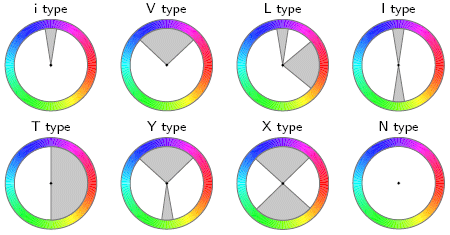
Figure 1: Color Harmonic Templates on the Hue Wheel
A collection of colors that fall into the gray areas is considered to be harmonic. The templates may be rotated by an arbitrary angle.
From “Color Harmonization,” by Daniel Cohen-Or et al., ACM Transactions on Graphics (TOG), Volume 25:3. July 2006. Proceedings of ACM SIGGRAPH 2006, pp. 624 – 630 © 2006 ACM, Inc. Reprinted by permission
An artist can assign harmonic colors by choosing from a pre-defined set in a handbook, or by using an interactive tool. Once the harmonic palette is defined, the artist needs to recolor and redefine areas of their image. This can be time-consuming, especially for complex images. The authors describe an automated recoloring tool that can be used to speed up the process. With a tool such as this one, artists can freely combine multiple images and automatically shift colors of foregrounds and backgrounds to harmonize their colors.
The Psychology of Color

Figure 2: WSO Analogous Color Scheme
The author’s color scheme for Websiteoptimization.com.
You’ll read that different colors and schemes evoke different emotions. Red and yellow are warm, while blue and green are cool. Red invokes action while blue is peaceful. Our dental clients tend to avoid red because it may invoke thoughts of blood, which they would like to avoid. For a concrete example I chose purple as the primary color for Websiteoptimization.com, due in part to the color of my book, and that purple is my favorite color. I chose an analogous color scheme rather than a complementary one (yellow and purple didn’t work for me), see Figure 2.
Purple is a combination of a warm color (red) and a cool color (blue) so it can yield different interpretations. Purple is sometimes called creative or regal. Presumably this is because only the highest ranking aristocracy could afford the purple (and blue) die that 3,000 years ago came from processing many snails, the Murex. It took about 9,000 snails to make a gram of dye, so it was prohibitively expensive. Fortunately, no snails were harmed in the making of this website.
How the Color Harmonization Process Works
The program first creates a “hue histogram” describing the distribution of colors of a particular image (see Figure 3b top). Then it finds the harmonic template (Tm) that best matches the hue histogram of the image, based on a best-fit optimization technique. The template, along with the associated orientation angle of alpha (α) defines a harmonic scheme. The program then shifts the pixel values to fall within the harmonic scheme’s boundaries around the color wheel. The shift is done to minimize the harmonic divergence with the optimum value of alpha (α) (angle of hues off the color wheel) across all possible harmonic templates. So the template with the lowest harmonic divergence wins.
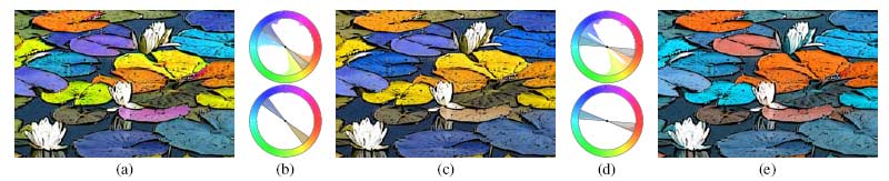
Figure 3: Overview of the Color Harmonization Process
(a) The original image. (b) The hue histogram of the image before and after harmonization. The top histogram refers to the original image, with best-fitting I-type template superimposed. The bottom histogram shows the hues shifted to match the template sectors. (c) The resulting harmonized image. Note that the harmonization tried to preserve the original colors as much as possible. (d) The user manually rotates the template (top), and the hues are shifted accordingly (bottom). (e) The result of
the manual choice of template orientation.
From “Color Harmonization,” by Daniel Cohen-Or et al., ACM Transactions on Graphics (TOG), Volume 25:3, July 2006. Proceedings of ACM SIGGRAPH 2006, pp. 624 – 630 © 2006 ACM, Inc. Reprinted by permission
Given a harmonic scheme they measure the color harmony of an image X thus (see Figure 4):
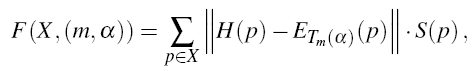
Figure 4: Calculating Image Harmony
“where H and S denote the hue and the saturation channels, respectively; the hue distance “|| . ||” refers to the arc-length distance on the hue wheel (measured in radians); hues that reside inside the sectors of Tm are considered to have zero distance from the template.”
From “Color Harmonization,” by Daniel Cohen-Or et al., ACM Transactions on Graphics (TOG), Volume 25:3, July 2006. Proceedings of ACM SIGGRAPH 2006, pp. 624 – 630.
Given an image X and a template Tm, the value of angle a 2 [0,2π] that minimizes the above expression defines the best harmonic scheme of X under the template Tm (see Figure 5).
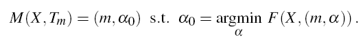
Figure 5: Optimizing Angle Alpha
“Where H and S denote the hue and the saturation channels, respectively; the hue distance refers to the arc-length distance on the hue wheel (measured in radians); hues that reside inside the sectors of Tm are considered to have zero distance from the template.” – From Cohen-Or et al. 2006.
The best harmonic scheme B(X) of a given image X is determined by minimizing the F function over all possible templates Tm (see Figure 6).
Figure 6: Finding Best Harmonic Scheme by Minimizing Function F
To find the best harmonic scheme of colors that matches a given image X, the algorithm iterates over all the harmonic templates at optimum angles to find the one that best fits the image. – From Cohen-Or et al. 2006
So the algorithm first finds the closest harmonic template (in this case a complementary I-type template) to the hue histogram. It then shifts the hues to match the template sectors (Figure 3c). Users can manually rotate the template to select other color combinations (Figures 3d & 3e). An accompanying video to the published paper on “Color Harmonization” shows the tool in action, complete with a popup of available harmonic templates users can choose from.
Other Color Considerations and Final Result
The authors describe the steps they took to preserve the original colors, spacial coherency (to avoid splitting contiguous regions), and density of hues in the original image. The final resulting image is automatically harmonized without requiring user intervention, although with split areas of contiguous color some user intervention is required (see Figure 7).
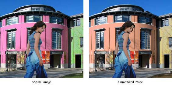
Figure 7: Color Harmonization Example
The researcher’s algorithm changes the colors of the background image to harmonize it with the foreground.
From “Color Harmonization,” by Daniel Cohen-Or et al., ACM Transactions on Graphics (TOG), Volume 25:3, July 2006. Proceedings of ACM SIGGRAPH 2006, pp. 624 – 630 © 2006 ACM, Inc. Reprinted by permission
Color Commentary
Color harmonization is usually a manual affair based on experience and intuition, assisted by color pickers and tools. A tool that automatically enhanced the color harmony of an image (or of a web page) would speed up the design process and allow exploration of different alternatives including combining different images into a unified whole. Unfortunately when we asked about the availability of this color harmonization tool, Microsoft responded that they currently had no plans to release it. Perhaps if enough people inquire, they would respond differently. Fortunately there are other tools available that help artists choose harmonious colors, although I know of none that automatically change images to harmonize colors.
Further Reading
- Adobe Kuler
- This free color harmony tool helps artists create harmonic color schemes. Kuler lets you browse other users’ themes or create your own using a drag-and-drop color wheel and numerical settings. You can create and label your themes, and download them as Adobe Swatch Exchange files for use in Photoshop and other applications. Requires Flash 9. Adobe Systems, Inc. Nov. 2006.
- Boyle, C. 2001, Color Harmony for the Web: A Guide for Creating Great Color Schemes on-line,
- Gives a brief introduction to color theory, the color wheel, and the history of color. Bulk of book are 2 and 3-color color sets of harmonious colors in various themes, including friendly, bold, and calming. Rockport Publishers, Inc. 2001, ISBN: 1-56496-603-8.
- Cohen-Or, D., Sorkine, O., Gal, R. Leyvand, T., and Y. Xu. 2006, “Color Harmonization,”
- This paper describes the automatic color harmonization tool co-developed by Tel Aviv University and Microsoft researchers. Automatically shifts the pixel values of a given image or combined images to harmonize the colors according to harmony templates and offset angles around a color wheel. To achieve natural-looking results the algorithm strives to preserve the original colors of the image, spacial coherency of contiguous or same-colored areas, and the density of hues. Unfortunately, according to the researchers the tool is not yet available. ACM Transactions on Graphics (TOG), Volume 25:3, July 2006, Proceedings of ACM SIGGRAPH 2006, pp. 624 – 630,
http://doi.acm.org/10.1145/1179352.1141933 - Color Matters
- Has an introduction to color theory on site.
- DeGraeve, S. Color Palette Generator
- Enter the URL of an image and this interactive tool gets a color palette that matches the image.
- Matsuda, Y. 1995. Color Design.
- Asakura Shoten. (in Japanese).
- Itten, J. 1997. The Art of Color: The Subjective Experience and Objective Rationale of Color (revised edition)
- New York: Van Nostrand Reinhold Company.
- Jensen, K. Color Blender
- Choose a preferred color and color blender comes up with a matching palette. Free interactive web-based service.
- Kaiser, S. 2007, Color Tools
- A wide variety of color tools, swatches, reference charts, and software.
- Tigercolor ColorImpact
- Interactively choose color schemes with this application, website includes color theory section. For Windows.
- Tipling, B. 2006, Color Tool 2.0
- AJAX-powered interactive color picker tool with a drag and drop interface and real-time changes shown on the page. By Bjorn Tipling.
- Whelen, B. (1998) Color Harmony,
- A handbook of harmonic color schemes in full color of course. Schemes include magical, energetic, and professional. Rockport Publishers, Inc. 1998, ISBN: 1-56496-066-8.
- Zuffi, S. 2006 Readability Tool Survey
- This interactive web-based tool measures thresholds for readability of colored text on a colored background. The University of Milano-Bicocca and ITC-CNR is currently conducting a controlled psychophysics experiment to determine this threshold, as described in HPL-2005-216. Concomitantly, the same experiment is being conducted also on the web. The purpose is to determine if uncontrolled psychophysics experiments conducted on the web yield the same predictions as those conducted under strictly controlled conditions. Please help the researchers collecting data by participating in the online test at http://daedalus.itc.cnr.it/readability if possible, with as many repetitions as you can without getting fatigued. The results will be published at the conference Image
Quality and System Performance IV, part of the IS&T/SPIE 19th Annual Symposium on Electronic Imaging: Science and Technology, to be held
28 January–1 February 2007, San Jose, California, USA.
What is more subjective than aesthetics? Perhaps one day a visually pleasing algorithm will be written and corporations will rule the art world, but that day hasn’t come IMHO. As we discussed over lunch today, neither of us prefer the “harmonized” images over the originals. I’d like to see a tally of your readers’ opinions: does this coded harmonizer improve the graphics or not?
Uncle Bob,
Yes, aesthetics is a subjective thing. However there are harmonic color relationships that can be mathematically defined. It is in how well a given tool uses these relationships that is the key. When I look at the above images, and the images in the original paper, some of them look better and “more harmonized” to my eye (for example Figure 3c above), but Figure 7 to my eye looks better before harmonization (the colors pop more and the purple and green are nearly complementary contrasting colors which helps). Of course as I mentioned in the article, I’m partial to purple so I may not be a good judge of this particular image.
The harmonized image of the woman before the buildings may be more harmonized mathematically (they harmonized the background to the foreground), and doesn’t jar the senses as much as the first, but what if you want to jar the senses? What if you want that image to pop? Perhaps they need a pop this image filter as well?
Enjoyed lunch as well Bob, let’s do that again.
– Andy
Good text.
It is important to note that “the psychology of color” is highly dependent on the cultural background of the observer. Even in the same country, there are different meanings for the same colors.
Sergio,
Yes, you are correct. Good point, was wondering if someone would point that out. People from different cultures interpret different colors in different ways. I think the interpretations are similar in western cultures, although I’ve read the meanings have changed somewhat over the years. Your mileage may vary.
– Andy
Fascinating article, because with the use of this color harmonizing we can find the correct color scheme for each style of website we wish to create; as you stated being able to tweak it to the “product or service being sold.” This also fits in with the different country and culture psychology of color, as we could not only harmonize the color for aesthetics but also for gender and nationality.
color harmony is an outdated idea. Our eyes and mind work together, not through equations but through neural networks that are able to trigger emotions. View http://www.pic2color.com to see how you can extract colors from pictures. You will notice that these colors are harmonious.
Excellent! I have always found myself to be quite color-illiterate. Yet, I love working with color, and do quite a bit of graphical work. I always have difficulty when it comes to choosing colors. What looks good to me inevitably looks terrible to everyone else. I guess there really isn’t any hope for me though, short of another 60 hour course on color theory. It is however nice to see that mathematics and artistic expression, once bitter enemies, are now trying to get along. Thanks for a great read.
Sorry. I don’t think you’ve improved on the lily pads. And in the girl in front of a building, I believe the “original image” photo has faked color. Your “improved image” photo more harmonious only because less jarring. Not convinced you have done anything useful other than prove color is a highly subjective subject and that normal people are easily influenced by anything spoken with an air of conviction and shrouded in the mystery of computer science. Perhaps you should put down your laptops and start looking at the world in front of your eyes.
i use http://www.colorschemer.com when i create a new, harmonic website design.
Thank you for this research. I wish you the best in advancing your goals. I have been searching for similar algorithms for chromatic relationships.
The matter for color harmony, is given here is very useful for students who are persuing in any technical course in printing technology.
Thanks!
In Figure 7: Color Harmonization Example, you have mentioned that – The researcher’s algorithm changes the colors of the background image to harmonize it with the foreground. Is there any built tool/application used for this kind of color manipulation with pictures?
Many of the popular prescriptions for successful color combinations use color names like red, green, purple. Perhaps more ambitious formulae might extend to magenta, ochre and so on. It is very sobering to open a research-based publication like Kobayashi’s Color Image Scale and go from page to page watching the way people’s judgments of color impressions shift with quite minimal changes in color variables. The four yellows on pages 46 to 49 for example are very similar but the most common descriptors shift from ‘flamboyant’ to ‘luxurious’ to ‘casual’ to ‘cute and childlike’. This is not just random variation. If you scan down the list of descriptors for each individual color you will see that they tend to be cohesive.
Furthermore if you put any one of these colors in the context of other colors or change the areas, etc. the impact changes. For example you may find two colors unappealing when they are juxtaposed as equal areas, but a thin line of one of those colors in a broad area of the other may look quite acceptable. The moral is, if you are paralysed with indecision, start if you like from one of these systems but always use your judgement or that of your colleagues to accept, reject or to modify the choice in line with your purposes. (Remember also if you are males that 8 percent of you are color-blind to one degree or another!)
I might also mention that the whole area of formulaic color systems is compromised by the fact that the color diagrams they depend on vary radically in the number and spacing of primaries: Itten (3) Swedish opponents (4) Munsell (5) CIE (6) so that even the complementaries they nominate are radically inconsistent. All this applies to “Color-ways “used in fabric design as well.
Peter