
Last time we tested the performance of a responsive redesign of PhillyDentistry.com. The new home page design was nearly twice as fast to load. In Part II of this series, we’ll explore the effects of the responsive design on other important metrics.
PhillyDentistry.com Results
PhillyDentistry.com was redesigned using a tighter layout with dynamic tabs and hierarchical drop-down menus (see Figure 1).
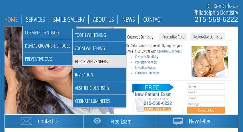
Figure 1: Phillydentistry.com Responsive Redesign Expanded Menus
Overall Results
Comparing the results 12 days before and after the site launched (on January 23, 2015) most of the results improved. Sessions were up 41%, users up 33.8%, page views up 58.7%, pages per session up 12.2%, and the average session duration was up 10.2% overall (see Figure 2). Only new sessions were down 4.4%.
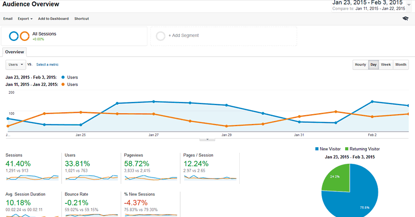
Figure 2: Phillydentistry.com Audience All Sessions Metrics
Desktop versus Mobile Results
The new responsive design launched on January 23, 2015. Before the new design the mobile site contained a small subset of static pages (5-6). After the redesign all the pages on the site were mobile responsive. Figure 3 shows highlights of the results (see Figure 3).
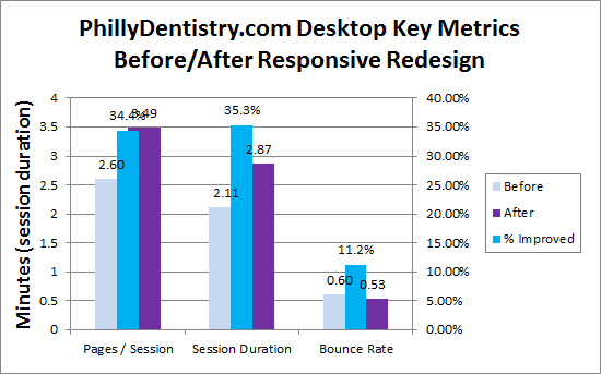
Figure 3: Phillydentistry.com Key Metrics
Desktop results improved in pages per session (34.4% higher), session duration (35.3% longer), and bounce rate (11.2% lower).
Mobile results improved in new users and sessions, average session duration (up 75.8%), and most importantly email leads (13 to 0). Overall, email lead generation improved by 14.8%.
It appears that the additional mobile-friendly content caused more mobile users to browse more pages, and stay 75% longer. This in turn caused more mobile users to email.
Conclusion
Overall the responsive design improved engagement and lead generation metrics. The number of users increased by 34%, page views grew by 59% and pages per session and session duration went up by more than 10%. Mobile leads jumped significantly, pushing total lead generation up by nearly 15%.
Further Reading
- Case Study: Responsive Redesign of PhillyDentistry.com
- Despite being 59% larger, PhillyDentistry.com’s home page tested nearly twice as fast than the previous design.
- Upgrade to a Faster Server
- Upgrading to a faster server can improve web page speed significantly. We found a 66% improvement for first paint time and 29% for load times for the Phillydentistry.com home page after the move.