
Responsive web site design is the practice of laying out your website with DIVs and CSS rules to work seamlessly on both desktop and mobile devices. Responsive designs transform the same content using CSS to linearize layouts, hide features, and create mobile-friendly buttons and click-to-call features useful on mobile devices like tablets and smartphones. This article shows a case study of PhiladelphiOrthodontists.com which was converted from a static HTML site to a WordPress responsive site.
Advantages of Responsive Sites
There are many advantages of converting your site to be mobile reponsive. You can capture the growing mobile traffic more effectively (as you’ll see below), make Google and other search engines happy (they look for responsive sites in their rankings), boost conversion rates, and if you code them correctly speed up your site.
- Engage more mobile traffic
- Boost search engine rankings
- Improve conversion rates (especially for mobile devices)
- Gather more phone calls (one click to call on mobile sites)
- Speed up your site (especially mobile)
PhiladelphiaOrthodontists Case Study
After reviewing the statistics for PhiladelphiaOrthodontists.com we found that mobile traffic was growing to the site, despite it not being mobile friendly. Dr. Roberts realized that making the site mobile-friendly would increase conversions and phone calls. As of April 2013 (when the new site was launched) mobile traffic was 20.1% of all traffic, and mobile+tablet was 26.7%. After the new site launched on April 5, 2013, mobile traffic increased to 25% in May, and mobile+tablet rose to 32.3% of total traffic, an increase of 24% for mobile and 20.9% for mobile+tablet (see Figure 1).
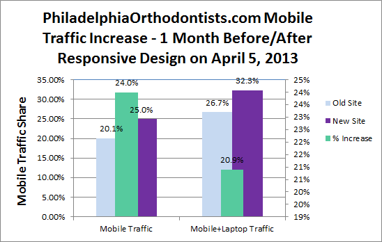
Figure 1: PhiladelphiaOrthodontists.com Mobile Traffic Before/After Responsive Redesign
About 1.5 years later, the mobile traffic has increased to 42.5% of total traffic, and 50.4% for mobile+tablet traffic (see Figure 2). One and one-half years after the new responsive site was launched, the mobile share of traffic has grown by 70%, and mobile+tablet share of traffic has grown by 56%. So more people now browse his site on mobile devices than desktop devices, now that the site is responsive.
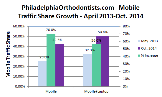
Figure 2: PhiladelphiaOrthodontists.com Mobile Traffic Growth From May 2013 to Oct. 2014 (Responsive Design)
PhiladelphiaOrthodontists.com Before and After Responsive Design
The site was a static non-responsive design before April 2013 (see Figure 3).

Figure 3: PhiladelphiaOrthodontists.com Old Design before Responsive Redesign cirka Jan. 2013
The new responsive WordPress site launched April 5, 2013 (see Figure 4). The site was converted from static Dreamweaver pages to more dynamic WordPress CMS.

Figure 4: PhiladelphiaOrthodontists.com After Responsive Redesign cirka Nov. 2014
Google Analytics Results
Looking at the analytics two months before and after the new responsive site launched on April 5, 2013 the site is stickier, especially for mobile devices. Highlights include the average session duration increased by nearly 80% for mobile devices (79.88%), and 39.3% for all traffic. Pages per session increased by 67.5% for all traffic (see Figure 5).
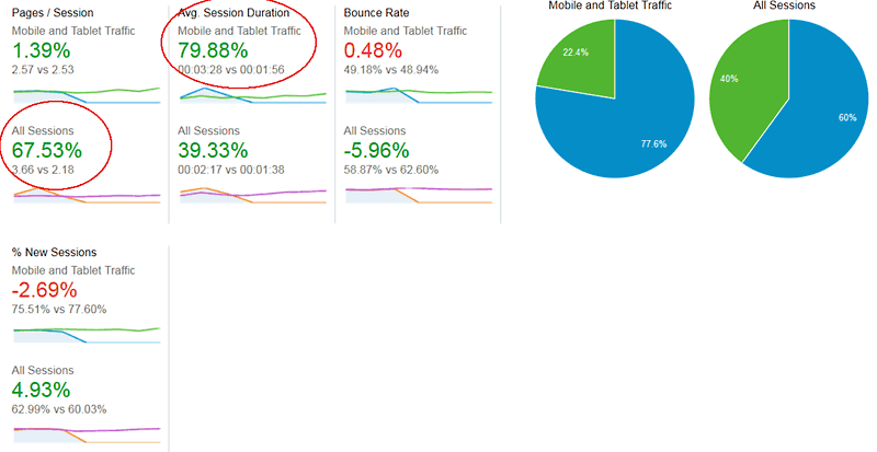
Figure 5: PhiladelphiaOrthodontists.com Statistics Two Months Before & After Redesign on April 5, 2013
Speed Increase
Converting the site to WordPress also improved load times, while some server times increased slightly (see Figure 6). Average page load times improved by nearly 32% (31.78%) and the average page download time improved by 36.7%. Page redirect and server response times degraded slightly (fractions of seconds). This isn’t surprising moving from a static to a dynamic site as the CMS incurs some overhead (fractions of seconds). This is a small price to pay for a more modern and extensible site.
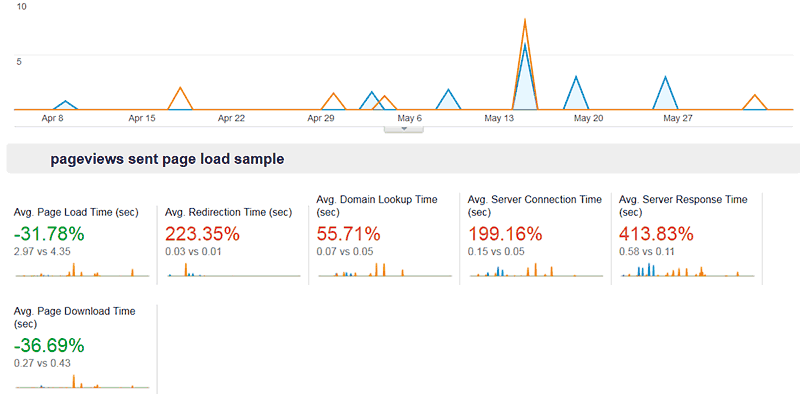
Figure 6: PhiladelphiaOrthodontists.com Speed Improvement Two Months Before & After Redesign on April 5, 2013
Conclusion
Converting a site to a responsive design increased mobile traffic by 21% to 24%, and average session duration by 80%. In other words more people browsed the site on mobile devices (now over 50% of traffic) and stayed 80% longer than before the responsive design.
Further Reading
- PhiladelphiaOrthodontists.com
- The subject of this article, website redesigned in WordPress as a responsive site on April 5, 2013. Owned by Dr. William Roberts, DMD.